I might not have been able to go to DC, but I did get something accomplished…
3 minute read
February 24, 2005, 11:18 PM
I did actually get something accomplished today! Inspired by the umpteenth Email about pictures not working, or the odd state of multimedia on the site, I finally pulled out all my Webmaster’s tools and went to work hammering out that long-deferred new design for the Today’s Special site. In order to keep things neat, there will be a strong influence from the current version of The Schumin Web. To keep its Today’s Special character, the color scheme and a number of other stylings will remain from the existing site.
So let’s compare old to new:

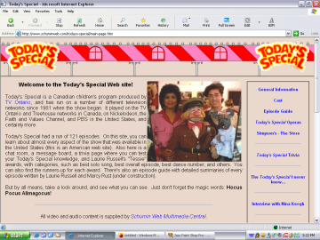
This is the old site. It’s got a classic layout and look, but it definitely needs an update. But it is indisputably Today’s Special. Note the inclusion of details from the Children’s Department on the show along the top of the screen.

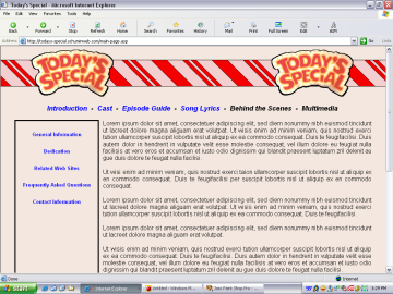
On the new site, as you can see, things are still VERY incomplete, with the text being “Lorem ipsum” filler text. However, the inspiration from The Schumin Web and the old version of Today’s Special is evident. I liked that menu-in-a-box look and carried it over. I also retained the same details from the Children’s Department in the new site. But do you notice anything different about them? They’ve been redone!
To make things more accurate, I popped in a tape of Today’s Special and watched it for details regarding the striping on the false roof in the Children’s Department. I knew there was more detail than my original design from 1997 (when the site was first created) had on it, but I wasn’t sure about all the intricacies of it.
On the T.S. site originally, it was simply pink-red-pink-red-pink-red etc. Just straight striping. And kind of wide. I also included crudely-drawn replicas of decorative details on top of the false roof, and also the columns supporting it. Plus we have the windows. Of course, all the choices of color came from the appearance of the sets from 1984 to 1987.
Now, in this new design, I simplified things quite a bit. Decorative details around the false roof itself, as well as the windows, are gone. However, the striping and coloring now matches that of the show more closely. Note the skinny stripes along with the wide stripes. Interestingly enough, I found the right color match for the pink by doing a Google search for “pastel pink” and ended up taking the color off of an image of pink crib bedding. I also re-scanned the Today’s Special signs in a much higher resolution. So now the logo reflects this most recent scan.
Other than these obvious design changes, a lot of other stuff is still up in the air. For one thing, I’m going to rewrite a lot of articles (since some date from 1997 when the site was first done) and get a lot of new video captures, both stills and movies. I am also considering dropping some features and adding others. I’m also adding a dedication to Sarah Lanthier on there, as she was a lifelong T.S. fan. You may recall that we visited the store together in 1999.
I think it’s great that I’m finally giving my T.S. site the royal treatment. After all, it deserves it, having been in a state of neglect for some years, with any changes being done hastily and not related to the content.
Song: Opening number for "Fun".
Quote: Doesn't this whole thing kind of remind you of the episode "Changes", where the store is redecorated?
Categories: Schumin Web meta, Today's Special


Leave a Reply