What can I say? I’m tickled. I just completed a version of my Journal that’s optimized for display and navigation on a Web-enabled cell phone. I call it “The Schumin Web Mobile Edition”.
And why only the Journal? Because the whole thing is database-driven, and thus it’s easy to convert. No having to do any reconfiguring on the regular site at all. I just created a second interface for it from scratch and ta-da. It looks like crap on the regular Web, but it looks fine on the phone.
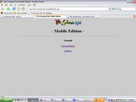
Compare what we see on the Web using a real computer…

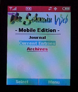
To the cell phone…

As you can see, it’s certainly optimized for a cell phone. Yay me. Now I just need to figure out how to tie it into the rest of the Web site.