The first attempt at a format change was Operation Sea Arrrgh. While it moved away from the old format, it didn’t go as far as I should have taken it, and looks kind of like a bunch of photos just thrown together – despite that it took a while to put it all together in a way that I liked. The one thing I liked about the Sea Arrrgh set from a design standpoint is that it places the photo captions on the full-size page, and not on the photo set page itself, which allows me to be a little more creative with the layout, because I don’t have to allow for potentially wordy captions when doing layout.
Now with Urban Demolition II, I’ve laid it out more like a gallery, with the same click-for-the-full-size-images procedure as always. The images on the set page are smaller, and there are more of them on a page. I like this layout because it tells a little story, and then lays out the images that go with that part of a story in a grid format.
So now I need to know if you like it or not. If you like it, let me know. Use the contact link and drop me a note. More importantly, though, if you don’t like it, I want to know what you don’t like, and why you don’t like it. I am looking for constructive criticism here. I want to know if you like it, and why you like it, and also if you don’t like it and why.
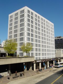
However, I can’t resist comparing this to the original Urban Demolition Photography set. The original set was only shot a block or so away from the new one. In fact, the building that was going to go up in the first set is in the background of a few of the shots in the new set. But for only a block’s difference in distance, they might as well be miles away in treatment. I made only one site visit for the original set in 2005. However, for the 2008 set, I visited the site nine times, though the first four were not specifically let’s-photograph-the-demolition trips out to Rosslyn. Then the older set used Big Mavica, which was standard at that time. The new one used the Kodak, for its only Photography set. The Kodak’s 10x optical zoom certainly lent itself for some creative shots, as the shots that look like they were taken from inside the building were actually done by zooming way in and framing it just right. I never went into the work site, and never even got on the roof of the sidewalk shed at Rosslyn Center (even though I could easily have gotten onto it), but the photos look like I did. Win for me.
So in the end, if you like it or if you don’t, I want to know what you’re thinking, and your rationale behind it.