This will mark the second time I’ve redesigned Schumin Web to have it end up looking almost exactly the same as it did before…
3 minute read
February 21, 2010, 12:30 AM
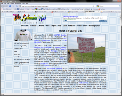
So I recently built a new template for Schumin Web for an upcoming site redesign:

I know what you’re saying – it looks exactly the same as before. Well, with the exception of the elimination of the vertical divider bar between the menu and the content, yes – it is basically the same, with only a few minor cosmetic differences. But under the hood, things will be a bit different. I’m finally getting away from using tables for page layout, and using CSS to lay the site out.
You’d think I’d have switched to CSS layouts years ago, but I didn’t. I started using tables for layout in the fall of 1999, when I started using that instead of frames. Frames were hip at one time, but by 1999, the frames fad had passed. So I went to a frameless layout the only way I knew how – by using tables. It seemed to work. And I went through seven redesigns using tables for layout.
My impetus for changing things now is because of my Motorola Droid phone. When I browse Schumin Web on the Droid, I use the regular Web site. I haven’t used Mobile Edition in a long time. And the regular Web site looks a bit funky on the Droid when the phone is held vertically. Horizontally, it did just fine, but when the phone is held vertically, it tried to cram everything into the left half of the screen. No good. So now with CSS layouts, I can drop Mobile Edition entirely, and do something smarter with CSS, creating a layout designed for regular computers, and one optimized for mobile devices (and finally offer the whole Web site for mobile users!). This will also make site redesigns a breeze, as I will now only have to write a new style sheet to make the site look totally different. No more manually moving pages over to new templates. Good riddance to it. It’s a pain.
Then I don’t know what it says when I carry the same design over a second time. Remember that when I converted the site to PHP after the old ASP site unceremoniously went down on me in 2007, the newly-converted site looked the same as the old one, with only minor cosmetic differences. I liked the layout, and wanted to keep it. Now, with the exception of the Online Store and a background change in 2008, my site has looked more or less the same since 2004. And the layout seems to work. But it does feel funny to sink hours of work into reworking the Web site for the end result to look almost exactly the same as before. But I think it will be worth it in the end.
I’ve done redesigns two ways – I’ve built the whole thing in a sandbox and then launched it all at once, and then I’ve done redesigns in sections, where each individual section is redone and released immediately. The 2004 redesign, which brought the current layout, was notable for that, since the site had two distinctly different looks for about two weeks in October of that year (with an “excuse our dust” message about the ongoing work). One was the old “blue cream fade” layout that was getting phased out, and then the other was the then-new layout. Then the 2007 redesign, which converted the site to PHP, was also done in sections, as I was intent on bringing the various sections back online as soon as possible, and thus they were released as soon as they were completed. All the others were launch-all-at-once. For this one, since there’s no urgency in getting things switched over, I’m going to do the all-at-once launch. I see no reason why not to. Then just hit the switch when it’s time.
And then a friend mentioned something that is very true – while the site is basically ripped apart, tweak it! Oh, most definitely. President Harry S. Truman did that in the 1940s when the White House was gutted and rebuilt. When they rebuilt the interior, they made changes in places, like how the Grand Stair now opens into the Entrance Hall rather than the Cross Hall. And with every redesign, some details on pages have changed. I’m sure I’ll find some sections that can be done better while I’ve got the site taken apart. Plus now I understand PHP includes a lot better than I did when I did the conversion in 2007, and so I think I can do it more efficiently, too.
So now that the test was a success, it’s time to develop a production template and get this redesign rolling…
Web site: How to Plan an Effective Redesign
Song: You Are A Pirate
Quote: So yeah, time to get cracking...
Categories: Schumin Web meta


Leave a Reply