Welcome to the new site!
5 minute read
June 25, 2010, 7:46 PM
Welcome to the newly-redesigned Schumin Web! Since February, I’ve been busy at work on the site, reworking the code and generally cleaning the site up, and now it’s finished and launched.
The main thrust of this redesign was to finally get away from using tables for layout, and do the layout entirely in CSS. I also pledged to do everything “right” this time, and not do anything kludgy. If I didn’t know how to make something work the way I wanted, then by golly, I researched it to find out how to make it work as intended.
However, the site still generally looks like the old site, since I admit – I really like the layout, and I saw no reason to make major revisions to that at this time. Why fix what’s not broken, after all? But that doesn’t mean I didn’t take the time to do a lot of smaller changes.
Let me give you a quick rundown on some of the stuff that’s new…
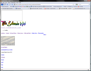
First of all, I’d like to prove that the new design uses CSS. Here’s a side-by-side comparison of the main Journal page with CSS turned off. The old site is on the left, and the new site is on the right:
Note how in the old site, the table being used for layout maintains the layout with CSS off. On the new site, the layout is broken with CSS off, with everything stacked vertically.
I also added a few new “Web 2.0” features. Every page now contains a panel of buttons for sharing with social networking sites above the menu:

I also have links at the bottom of every page that provide links to the site’s Facebook page and my Twitter feed:

The Journal now also has a direct link to my Twitter feed, since I’m using the Twitter like an extension of the Journal.
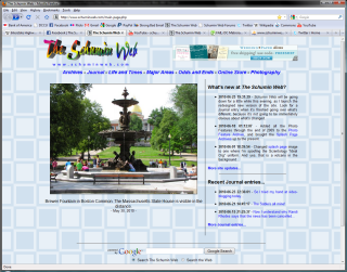
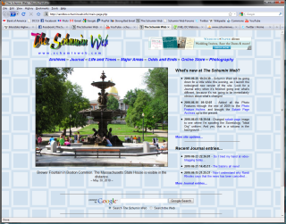
Overall styling goes for bigger and cleaner. Compare main pages for a moment (old left, new right):
First of all, no more vertical bars for dividing lines. In their place, I made sure to have sufficient clear space between areas to set spaces apart without the need for long black lines. Additionally, the entire template is wider, and new features on the site can take advantage of the larger space. The Photography sets Urban Demolition II and UNITE HERE Picket already do, since the former was slightly too large for the format to begin with (and now fits), and with the latter, I had deleted some clear space between photos to make it fit before, and now I was finally able to spread it out to where it should have been all along. The Photo Feature now takes advantage of the new space, with the horizontal format photo slightly larger. This has the added benefit of giving the main page better balance as well, since with the previous size, the side content (the updates and the Journal entries) often dropped lower than the end of the photo feature (and that looked cheesy).
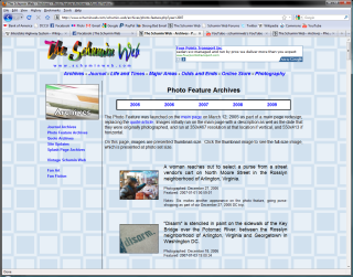
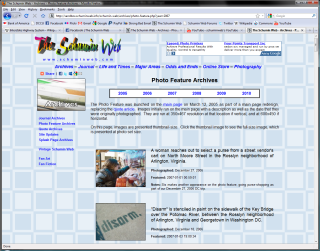
On the same topic of larger size, every photo set from A16 to the present has had its full-size photos upgraded to 950 pixels wide. For photo sets that had the bug in the corner of the full-size images, that bug is now gone. Due to the way original material was handled for photo sets older than the A16 set, it was not feasible to do this for photo sets older than A16. This larger size also carried over to the Photo Feature Archives. Take a look…
Bigger sometimes truly is better, no? It also makes the descriptions fit better.
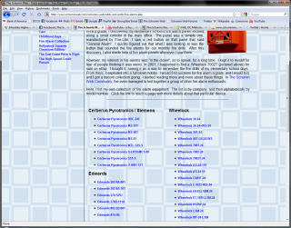
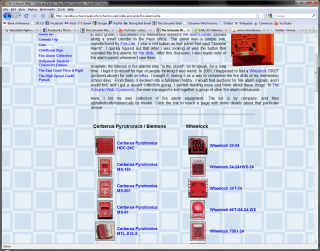
And then the Fire Alarm Collection pages are enhanced:
What was once a text list has now turned graphical. Hopefully that will make it far easier to find what you’re looking for, with thumbnail images showing what each device looks like.
I also used the redesign to introduce four new photo sets – two in Photography, and two in Life and Times. The new Photography sets are Abandoned Grocery Store and Maryland Polar Bear Plunge 2010. The new Life and Times sets are Year 2009 and Schumin-Lysy Wedding. Additionally, Vintage Schumin Web received a complete rewrite. It made sense to complete these things now, while I had big design-the-site momentum going. The “Vintage” page just had horrible writing, and then the photo sets just kind of came together once I really got into working on them.
By the way, the new Photography sets introduce another new photo layout. The earlier layouts, due to the photos’ small size on the set page, really looked too “busy”. This one arranges photos in threes and hopefully makes a set that’s more visually appealing. And as always, I want feedback on the new photo layout.
And here’s a plus for all of my fellow Web designers in the crowd: I deliberately made sure not to break any links. All of your old page links should still work if I did everything correctly (and I believe I did). The only page that changed its address is the Canada Photos page in Odds and Ends, but somehow I doubt that anyone really ever linked to that page directly from off-site.
The various subsidiary sites and the Online Store are unaffected. They were not part of this redesign, and so nothing will change on those sites as a result of this work.
So there you go! Hopefully this new design will last me a while…
Web site: css Zen Garden: The Beauty in CSS Design
Song: Gene Rayburn attacks the camera in Match Game 77
Quote: Dear Microsoft: I hate you. Why can't you make an actual standards-compliant browser rather than being the stubborn little child that decides to do its own thing? I designed the site in Dreamweaver and tested it primarily in Firefox. It works on all the standards-compliant browsers, and even works well on Android. The additional testing required for Internet Explorer and subsequent reworking and additional research to solve IE-specific CSS quirks was a colossal pain in the butt and added many hours to this redesign job. I had no major surprises when I cross-checked in Safari and Chrome. But IE kept throwing surprise after surprise at me...
Categories: Schumin Web meta






Leave a Reply