Trying out a third concept. Your opinions appreciated.
5 minute read
August 26, 2012, 12:36 PM
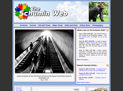
So I’m now on my third design concept. This one, as I kind of indicated before, I decided to finally design for a larger resolution, after about eight years of designing for 1024 pixels across. Now I’m designing for 1280 pixels across, and then I will use CSS to scale this down for smaller widths once I get the main design going. So here are some sample screenshots:
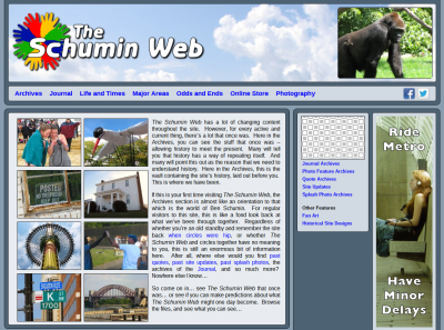
Archives main page.
Categories: Schumin Web meta
New fire alarms at work… again…
7 minute read
August 24, 2012, 10:17 PM
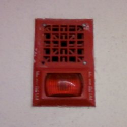
So apparently the folks who run the building where I work are looking to improve the fire alarm system. Recall that in 2009, the fire alarm notification appliances were replaced after an incident where someone pulled a fire alarm in our building due to smoke from a car fire in an alley behind the building, and those of us looking out the window at the fire couldn’t hear the alarm going off. For that, we started with Wheelock 34 horns and Space Age AV32 light plates:
Categories: Fire alarms, Work
So tonight, I had an “aha” moment…
3 minute read
August 21, 2012, 11:39 PM
So I had an “aha” moment tonight while trying to figure out how to shoehorn an above-the-fold ad into the otherwise nice looking design concept that I showed you a week or so ago. I was looking at this page and noticed how it had advertisements to the side, and made good use of all of the space regardless of screen size. I resized my browser window to make it really narrow, and the site rearranged itself to work in the smaller space that it was now in without horizontal scroll bars. I studied its CSS and then did a little research on what I found.
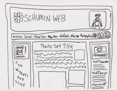
And then I had my “aha” moment. I can use CSS to design for different resolutions. I can design for a wider resolution than I’ve been designing for, and use CSS to optimize it for netbooks. As of late, the ultimate arbiter on width for Schumin Web has been my netbook, with its 1024 pixel width. If I got horizontal scroll bars for my design, then I was designing too wide. Complicating things is that my site uses a content panel that’s around 750 pixels wide and makes good use of all that width, especially in Photography. Having another 250 pixels to work with is a game changer. So I sat down and doodled, and this is what I came up with:
Categories: Schumin Web meta
It pains me to say this…
3 minute read
August 20, 2012, 8:12 PM
Yes, it pains me to say this. Literally. It only took 25 years of using a computer to do it, but I have managed to give myself a repetitive stress injury from typing. I know – I’m as surprised as you are. And it’s not what you think, either. I figured that eventually, I would do something to my wrists from all of the stuff that I do on the computer despite the precautions that I take, like using a wrist pad. Turns out that my use of the wrist pad, which is a habit that I picked up from my job at the phone company more than a decade ago, has done me a lot of good, because I didn’t injure my wrists.
No – I injured my left thumb. And you know what I did to injure it? This:
Categories: Personal health
Taking the swimming outside for a week…
6 minute read
August 16, 2012, 10:52 PM
So this week and next week are when Olney Indoor Swim Center, the place where I normally swim four days a week, is closed for its annual maintenance. During that time, as I understand it, they drain the pool and acid clean the pool sides, do maintenance on whatever systems, change any lights that need replacement, deep clean the entire building, and then fill the pools back up. I’m told it takes four days to properly drain the main pool so as not to overload the wastewater system by letting too much water come through at once.
In the meantime, I am continuing to swim. This year, I know what I’m doing in the pool, and so the annual maintenance period does not coincide with a nasty case of swimmer’s ear. Last year, you see, the where-to-swim problem resolved itself with the whole ear infection thing, since that kept me out of the pool entirely for that time. This year, I decided I wanted to try an outdoor pool. I’ve been to the other county indoor pools, and each of them had various qualities that made me pick an outdoor pool over them. MLK Swim Center is really old and closes kind of early. Montgomery Aquatic Center (pardon – “Kennedy Shriver Aquatic Center”) is of reasonable distance away, but the staff there really gets on my nerves because they’re so uptight about everything and act like they’re doing me a favor for stuff that the staff at the other pools would do without all the whining. That and aside from late night laps (i.e. 9-10 PM) on Mondays and Wednesdays, the pool is so booked up with other programs that there is no room for evening lap swimming anyway. Now Germantown Indoor Swim Center is a gorgeous facility, which I’ve been to once before. I love Germantown indoor pool, but Germantown is just too far away, being in the northern part of Montgomery County and all of that. It’s a bit of a hike from my house, and if I left right from work, that would be double the distance and in rush hour traffic to boot.
So with that all said, I decided to give an outdoor pool a spin while Olney was closed.
Categories: Swimming
SlutWalk DC was pretty fun, but a bit tamer than last year…
5 minute read
August 16, 2012, 12:06 AM
So this past Saturday, I participated in SlutWalk DC 2012. You may recall that I covered SlutWalk DC in 2011. SlutWalk’s goal is to demonstrate that it doesn’t matter what a person is wearing (or not wearing). Sexual activity requires the consent of all involved, and sexual activity without the consent of all involved is rape. So in short: consent is key. Consensual sex is sexy, but nonconsensual sex is rape. And clothes are inanimate objects. They cannot give consent for their wearer.
However, I was a little bit disappointed with the turnout on this one. I thought that last year’s event was fairly well attended for a DC event with a local focus. After all, SlutWalk in DC isn’t a national event. Cities have their own local SlutWalk. This wasn’t a bus-em-in event with a national scope like September 24, 2005 or January 27, 2007. But this year, the crowd felt a bit smaller, both in Lafayette Park and at the Sylvan Theatre. I also thought that the signs were less exciting and less creative than last year’s, and that things were generally a bit tamer overall than before. I also noticed that the gender balance was a bit more skewed towards the female side than last year. I expected a majority of the attendees to be female, but I felt like there were very few guys there this time.
On that last note, I think it’s very important for men to go to events like this because helps balance the message. It helps send the message that rape and consent is a serious matter and important for everyone, and not just for women. Men can also be the victims of nonconsensual sexual acts, and so the issue of consent is by no means something that only affects women. Additionally, by having a good amount of men there, it also helps to prevent the event from being perceived by some, justified or not, as male bashing. I didn’t get that perception during the event itself last year, but interestingly enough, I got that feeling when I was putting the photo set together at home several months after the event. And I figured that if I got that vibe while working on the photo set, it would be reasonable to think that others might pick that unintended message up as well. Thus in putting the photo set together, I deliberately tried to counter the perception that I was getting by including more photos that focused on sex-positivity or that had a more lighthearted message. I definitely included some serious photos (particularly this one), but I tried to keep it balanced for the most part. I think I was pretty successful in keeping the photo set’s mood light, but ultimately, you – the reader – will be the one to make the call about whether or not I was actually successful in this.
Categories: Activism
Another concept, another request for feedback…
4 minute read
August 12, 2012, 11:49 PM
So I took the concept design that I showed you about a week ago back to the drawing board and made some changes. This is actually both a step forward and a step back in the progression of things. While this design builds on the earlier design, it actually throws out the theme work I did in the last design. The earlier design was a completely new theme, while this one I’m about to show you directly modifies the current production theme. The reason for throwing out the newer theme was because I had so many problems with it. That made throwing it out worthwhile. Dirty little secret: some of the details in the other theme were fudged with a graphics program, since I couldn’t get the CSS to work out the way I wanted.
So here are the screenshots:
Categories: Schumin Web meta
And the fruit is photographed…
4 minute read
August 5, 2012, 9:00 PM
At last, it is done. I went down to Eastern Market earlier today and did something that I said I’d wanted to do for a while: photograph food. I visited most of the food vendors over there and photographed the fresh fruits and vegetables that were out for sale. I photographed so many different kinds of tomatoes, peppers, and mushrooms that it’s not even funny. I certainly got a lesson in foods, though. I didn’t realize that tomatoes came in so many different colors. First, there’s this one, which looks pretty conventional, at least to my grocery store shopping eyes:
Categories: Photography, Washington DC, Weather
Okay, folks, feedback time!
2 minute read
August 4, 2012, 9:30 PM
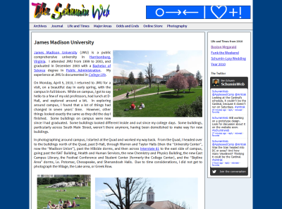
So I spent some time today playing around with a new theme for the site. Something on the way towards the ultimate goal: a new look for The Schumin Web after nearly eight years with more or less the same design.
In making this new design, I put what I had been throwing around for a while in my head into Dreamweaver to see what it would look like. And this is what I came up with:
“James Madison University” Photography set
Categories: Schumin Web meta



 Continue reading…