So tonight, I had an “aha” moment…
3 minute read
August 21, 2012, 11:39 PM
So I had an “aha” moment tonight while trying to figure out how to shoehorn an above-the-fold ad into the otherwise nice looking design concept that I showed you a week or so ago. I was looking at this page and noticed how it had advertisements to the side, and made good use of all of the space regardless of screen size. I resized my browser window to make it really narrow, and the site rearranged itself to work in the smaller space that it was now in without horizontal scroll bars. I studied its CSS and then did a little research on what I found.
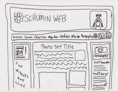
And then I had my “aha” moment. I can use CSS to design for different resolutions. I can design for a wider resolution than I’ve been designing for, and use CSS to optimize it for netbooks. As of late, the ultimate arbiter on width for Schumin Web has been my netbook, with its 1024 pixel width. If I got horizontal scroll bars for my design, then I was designing too wide. Complicating things is that my site uses a content panel that’s around 750 pixels wide and makes good use of all that width, especially in Photography. Having another 250 pixels to work with is a game changer. So I sat down and doodled, and this is what I came up with:
Notice that beautiful second sidebar on the left side. And notice the ad within it (for “Astronamos”, referenced in an episode of Power Rangers in Space). Then stuff would otherwise go beneath it, including possibly a second ad. Then the regular sidebar would go on the right. And my header remains intact, but widened a bit. And yes, I’m wearing a Power Rangers costume in this doodle. Then otherwise, on the sections bar, it was my intention to left align the section names and put those three icons to the right with some space in between, but I can’t write small enough for that, at least not with a Sharpie.
So why is this a doodle and not something done with the computer? Because it’s easier to explore a concept with a marker and paper than with Dreamweaver sometimes. Dreamweaver work is much slower because there’s a lot of back-and-forth with writing code and checking it in a browser, etc. Compare to a marker on paper, which is basically… like using a marker on paper (duh). It was quick and dirty, and it led me to think that I want to explore other concepts rather than pursue this one further. The problem was that it kind of looked like I was taking the design and adding a third box to the side of it to make the advertisement fit. And I think if I’m going to design for a bigger space as the “default” width and then degrade it gracefully for lower resolutions, then I need to look at that as a big picture and play with my space a little bit more. Perhaps I must sleep on this and see what sort of damage I can do in exploring something new this weekend.
And in any event, feel free to give your suggestions in the comments below. Removing my 1024 pixel width restriction definitely makes me feel freer, but I don’t quite know what to do with all of that new space.
Categories: Schumin Web meta


Leave a Reply