Now let’s talk about the Journal…
3 minute read
September 3, 2012, 5:16 PM
You may have noticed that, except for the “Magic” concept, I never showed you pictures of the Journal. If you go back and look at the Journal entries where I introduced the last three concept designs (first, second, and third), I show the Main Page, I show photo sets, I show intro pages, and whatever other pages, but never the Journal. That’s because I hadn’t quite nailed down how I wanted to do the Journal.
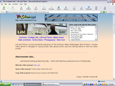
Going into this, realize that the Journal has never seen a major redesign since it was introduced nine years ago, in July 2003. Here’s a screenshot of the Journal from then, while the Journal was still in its original place on the front of Life and Times, just before it launched:
Still looks pretty familiar, doesn’t it? The colors are different and the header is different, but those Journal entries, for the most part, still look like they do today. In fact, I tried to refresh the Journal during the conversion to WordPress, and end up being dissatisfied with it, and reverted back to the original look. Now, with a new look entirely, I think I’m ready to shake things up a little in the Journal. I downloaded and played with about fifty or so different WordPress themes on my “sandbox” site to see how they displayed posts. I saw things I liked and I saw things I didn’t like. And I came up with an idea of what I wanted to do. And here it is:
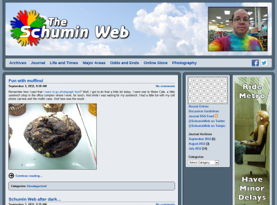
Top of the page, above the fold, showing the first Journal entry.
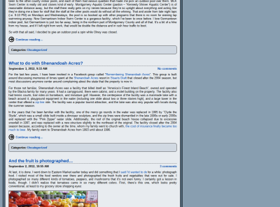
Middle of the page, showing Journal entries in a row.
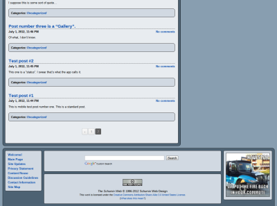
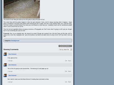
Bottom of the page, showing pagination.
In a nutshell: the date, permalink, and comment count are now at the top of the entry. The permalink is now directly on the title. Dotted line beneath the title. The Journal entry itself is now full width. Categories are now in a box at the bottom. No more share box.
I think that this new design looks much cleaner and more modern than the previous design. The question now becomes, is it “me”, or does it look generic? The old Journal design was nine years old and looked a little amateurish, especially when put against this new design with all the rounded edges.
I’m also pretty comfortable in saying that, for the site design overall, the redesigned site will probably look very close to what you saw in the third concept. The link color was refined based on a comment I received, and it seems to work. Now I just need to see how this Journal design looks, and I think I’ll have it.
Funny, though, is the missing share boxes. When I put those in with the 2010 build, I thought it was going to be good for the site, since people would be able to share content right from the website. The answer: no. I think I only got about three clicks on them in two years, and I’m pretty sure that those were all from me for testing purposes. So in short, no one ever used them, and they were wasting valuable real estate. If it tells you anything, I didn’t even use them. I would shorten and share directly in Bitly. So they’re gone.
So please leave a comment below. Let me know what you think!
Categories: Schumin Web meta




Considering that no one’s commented on this entry, I figure that either (A) you like it, (B) you’re tired of my trotting out endless prototypes, or (C) both. In any case, I think I’m going to probably go with this.