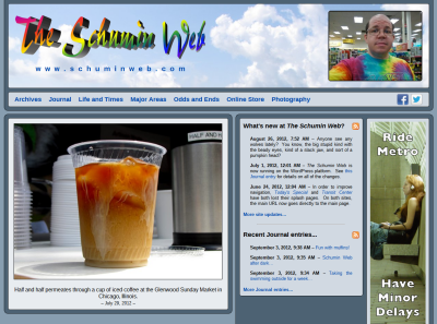
And so this is (roughly) what the redesign will look like…
2 minute read
September 10, 2012, 12:36 AM
So this is what it’s going to look like:
This shouldn’t really surprise anyone. The various reviews of this design were favorable, and so I’m going to move it towards production. “Moving it towards production” in this case means, now that I’m settled on the design, building it for real with the cleanest code that I can possibly write. After all, when I’m designing and testing, I’m not necessarily being the neatest that I can be. I’ll comment code out, make code obsolete, or otherwise leave “debris” around. The production version, however, will have only what it’s supposed to have, and no more (and no less).
Now considering how much I avoided using my regular logo with this design, it may surprise you to see the regular logo back in the header. This is like a repeat of when I initially converted to WordPress. Recall that I was originally planning to do everything at once: conversion, design, and logo. Then I decided to “split the baby” and do the conversion separately from the redesign, carrying the old design over to the new engine, because the redesign was threatening to delay the entire process. Now I’m splitting things again. The logo is getting split out of this project, and I’m putting my existing branding back in. A new, more modern logo will come later. Your suggestions about what I should do for a new logo will be greatly appreciated (especially if you leave them as a comment below!).
Considering how long the current design has been running, however, this is going to be a bit of a shift for folks. A lot of people that I associate with on a regular basis have only known Schumin Web with the squares pattern. Even more people only know Schumin Web with the menu-on-left design that originated in October 2004. If you do the math, you will find that the site has looked more or less like this for a little less than half of its entire existence. Time to shake things up.
Then I’m also planning on releasing two new photo sets in Life and Times around the same time as the redesign. One will be that highlights reel from Chicago that I discussed previously. Then the other one will be a “clip show” photo set going over the last eight years with the various incarnations of the current design. Don’t ask how I’m going to theme it, though, because I’m not entirely sure yet.
And now, it’s time to start writing nice, clean, standards-compliant code…
Categories: Schumin Web meta


When does this happen? I can’t look at these squares any longer.
Saturday night! Look for it this weekend.