“I am always so thrilled when people realize how much better a place can look with just a few simple changes!”
10 minute read
October 12, 2014, 12:07 PM
This past week, I finally finished the work that I’d been doing at my house for the past two months. The way I figured, since there was a period of time while the various processes related to onboarding at the new job were still coming together, I might as well take the time to finish a few things on my to-do list. It’s funny, however, what inspires a person to decorate. Back in July or so, my friend Suzie described my house as “a hot mess”. I thought about that over the next week or so, and came to the conclusion that she was right. And I admit – it was looking a little bit too “lived in” at the time, with a lot of unfinished business all over the place. The closets were not being used to their full potential, I had a pile of stuff on the counter between the kitchen and the living room, the table was full of junk, and there were things in visible locations when they should have been in closets.
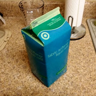
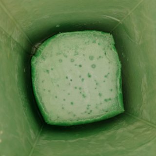
I started out on August 5, doing what I called the “demolition” phase. This was where I cleaned out the closets and determined what I wanted to keep and what I wanted to get rid of. It’s amazing how much junk can fit in a one-bedroom apartment. I ended up getting rid of a ton of stuff. I had long-outdated information about the 2008 Democratic National Convention from the Unconventional Action consulta that occurred in January 2008. I had the banner from the black bloc at the National Equality March from October 2009. I had an expired bottle of generic Solarcaine from the time when I got sunburned at Splash Down Waterpark in June 2008. I also had a carton of fabric softener from 2007 that I had never opened, where all the liquid had been absorbed by the carton itself, leaving a blob of whatever solids were in the softener at the bottom. No, seriously. Take a look:
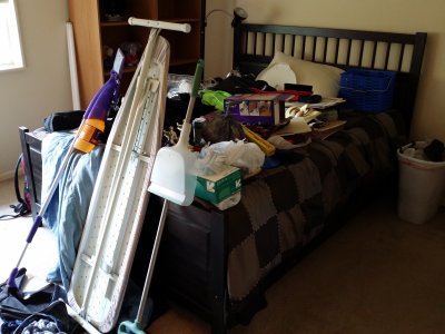
I believe that those light parts on the carton were supposed to be white, not a celadon green. And yes, the solids in the bottom had collected and then pulled away from the sides. Pretty crazy. Then this was the pile of stuff that I pulled out of the bedroom closet and the hall closet:
That’s a lot of stuff. And because of this, I inadvertently evicted myself from the bed for a few days, and thus was sleeping on the couch while this part of the project was going on. Next time I clean, I’m not putting all of the junk on top of the bed unless I can have it cleared the same day.
Then once the closets were empty, and various other pockets of junk were cleaned out, including the kitchen table, the counter, and whatever else, it was time to sort, organize, and then start returning stuff to the storage spaces. I got rid of a whole lot of junk, gave a lot of stuff away, and found new homes in the house for the rest. I also rearranged the shelves and the cabinets to make everything fit more nicely. I actually ended up with a few empty shelves in the closet when I was done.
With the cleaning done, the next step was to look at decor. I had been meaning to decorate in here since I moved in back in 2007, and never made much headway on it. I hung up a bulletin board and a whiteboard fairly soon after moving in here, I hung the Metro map on the wall within the first few months, and then I did the threatening letter from Scientology and the mirrors in 2008. I bought picture frames from IKEA in 2008, but then I didn’t bother to do anything with them after that. Thus the living room looked pretty spare for the last several years (and note the frames against the wall). The plan had always been to hang my own photos in the frames, but that was pretty low on the list of priorities. I had come up with a plan in 2008 for how I wanted to arrange the photos and bought the frames based on that, but since then, I had forgotten what that plan was. So I ended up coming up with a new one. Then I also had to pick the photos. I went through the website and my Flickr to come up with the stuff that I wanted to put in the frames, and came up with what I thought were good selections.
In printing the pix, I found out pretty that haste makes waste. I wanted to get the photos done quickly so I could get them framed, and so I submitted the pictures online for one-hour processing. I got this back:
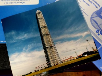
One of my photos from the Washington Monument set after one-hour processing. The color was very much off, and the photo had vertical lines down it.

Photo of a disguised cell tower near the Intercounty Connector off of Bonifant Road a few miles from my house. This was the photo feature for the week of December 22, 2013. The color on this one was right, but the vertical lines were there.
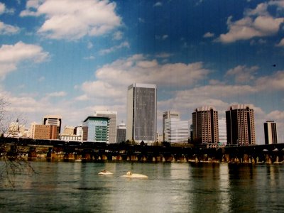
The Richmond skyline, which I ran as the photo feature on March 31, 2013, and later featured in the Richmond 2013 photo set. Again with the bad color and vertical lines.
The color issue was unfortunate, but the lines were inexcusable. The fact that they actually let a photo with those lines on it get out just astounded me. After I brought the photos back to the counter to show the employee the problems, the employee actually tried to blame me for the problems. Yeah, that’s good customer service for you. Blame the customer for problems with your equipment. Needless to say, I got a manager over, and I got every penny of my money back.
After that incident, I ended up reevaluating my photo selections, swapping out a few photos (including all three of these), and then, on the advice of my friend Suzie, ordered prints through Shutterfly and had them shipped to the house. Those prints came out perfectly. If you want to get digital photos printed, use Shutterfly. It is well worth it. Then I put them all in frames as I planned.
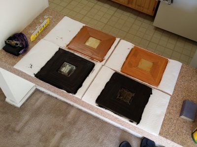
I also stained the remaining four Malma mirrors from IKEA that I got in 2008. The original plan was to stain two of them in a wood color to match the furniture in the living room and put them on the wall over the aforementioned counter between the kitchen and the living room. That color didn’t look right facing the living room, but it looked great facing the kitchen. I ended up staining the other two mirrors with the same black stain that I used on the bedroom mirrors, and they looked just fine on the living room side. This was how that project looked midway through:
Not too shabby. And you can kind of see how the brown color harmonizes with the kitchen cabinets (in the background).
I also reframed the “Dinosaur Canyon” picture, as well as a painting that I did in 1996, to match the other frames, took down the bulletin board and whiteboard, took down the Scientology letter, patched all of the old nail holes, and then started putting things up again. The plan was for the living room to mostly feature my photography, the bedroom was going to be a little more whimsical, and then I was going to put up some stuff in the bedroom closet that I didn’t necessarily want to prominently display, but wanted to look at regardless. Plus I put up an empty fire alarm shell in the living room.
Lastly, I did a deep cleaning of the whole house. I even rented a carpet shampooer and gave the carpets a once-over, as I had not deep cleaned the carpets since December 27, 2008, so it was well past time for that again.
And after all that, I now present to you the results of my labor. Let me give you the tour:
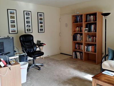
This is the living room, facing the front door. The three frames on the wall are themed. The far left one features material from the Sandy Point State Park photo set from February 2013. The middle one features the Asbury Park Casino, from when I went up there in October 2013. The right one contains photos from the Chicagoland area that I took in 2012 and 2013.
These are the photos that I used:
- Left frame: First, second, third, fourth, fifth
- Middle frame: First, second, third, fourth, fifth (I converted all of these to black and white)
- Right frame: First, second, third, fourth, fifth
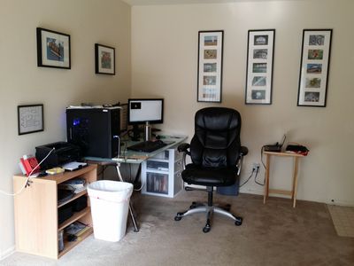
The other side of this wing of the living room, where my desk is. The photos over my desk are of Mars Cheese Castle in Kenosha, Wisconsin, and a bottle of Mexican Coca-Cola. The unifying theme between these two photos was “commercial”. The frame over the printer and fire alarm contains the original for the “sick copier” drawing that I drew in 2009.
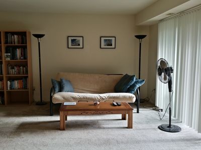
This is the other end of the same wall that the front door is on. The theme here was “monumental”, as I have a photo of the Washington Monument in scaffolding and the Roanoke Star on the wall.
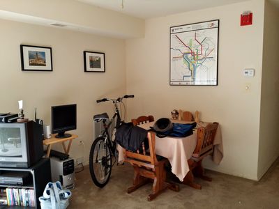
Turn around from the last photo, and there are two more frames that together took the theme of “infrastructural”. The left photo is of the Asbury Park Heating Plant, and the other is the Maryland Midland Railway in Westminster. I put the old computer down behind the television to use as a backup server. It is there to back up the network drive, and has its own monitor, though if I need to access it, I normally do so remotely. Then the other wall has my Metro map (that didn’t change), and the fire alarm.
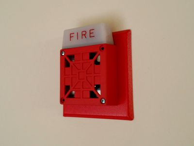
The empty Wheelock 7002T. Still one of the coolest things to have as part of the decor.
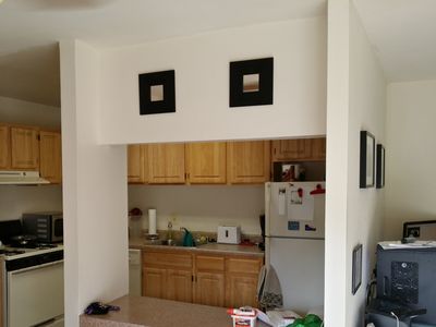
The Malma mirrors from IKEA that I stained black, over the kitchen counter on the living room side.

The Malma mirrors from IKEA on the kitchen side, stained brown.

The bulletin board is now in the kitchen. It makes far more sense to have this in the kitchen than in the living room.
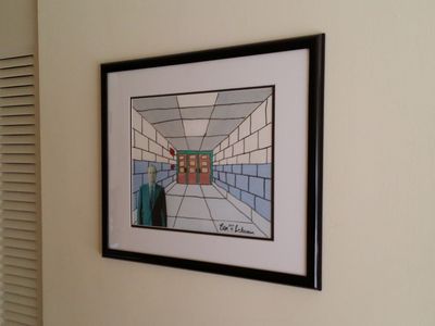
This is a painting that I did in June 1996 during a weeklong arts program that Augusta County did. This is the corridor at Stuarts Draft High School that was right in front of where my locker was located, and where I used to enter and exit the building every day. The walls were two-toned back then: blue-gray on bottom, white on top. The floors were terrazzo. The door frames were green (but not that bright of green). The fire alarm horn was a Simplex 4040, and the pull station was a large-size Couch pull station, branded Simplex (I have the coded version of it). The guy is in the picture because part of the project was to paste an image from a magazine in, and so I picked this guy out of an issue of National Geographic. I have no idea who that person is. If you know who he is, let me know in the comments.
I have a photo of what this corridor looks like today in the Stuarts Draft High School photo set in Life and Times.
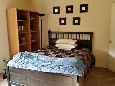
This view of the bedroom is unchanged from before. The mirrors and everything are the same.
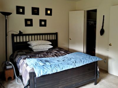
This way, too. Nothing changed.
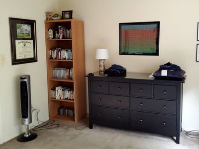
Over here, besides neatening up quite a bit, I added a lamp filled with shells from a trip to the Outer Banks that I made with my friend Pete back in June, and I hung Dinosaur Canyon up on the wall over the dresser in its new black frame. My degree from JMU remains on the left wall. On top of the bookshelf is a photo from the National Equality March that I took of one of the people in the black bloc. I always wanted to frame this photo because it looked awesome, but I didn’t want to emphasize it as much, content-wise, so it ended up here.
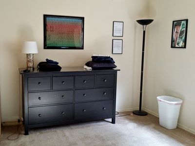
On the other side of Dinosaur Canyon is the Scientology letter, now in the bedroom. On the other side of the lamp, next to the window, is an autographed picture of Jason David Frank (i.e. Tommy Oliver, the original Green Ranger) that my sister got me.
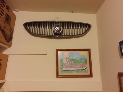
On the back wall in the closet, this is the original grille from the Sable, which I knocked out as a result of hitting a deer, as well as an illustration of a shoe that I drew in October 1996 while in after-school detention (probably for running my mouth).
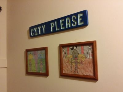
The “CITY PLEASE” sign is one that I carved in an art class in 11th grade. It was based around my job at that time as a directory assistance operator, where we used to answer calls, “City, please?” Yeah, I was a geek back then, too. Then beneath it are two drawings that I did of Power Rangers settings. One is of a Purple Ranger character that my sister came up with, done in the Mighty Morphin and Zeo costume styles. I’m really pleased about how that Command Center (the Brandeis-Bardin House of the Book in real life) came out. The other picture is one that I drew of Lord Zedd in his palace, with his throne behind him, and Z-Putties on either side. I scanned both of these drawings back in 2012.
So that’s the place. What do you think? I think that it goes to show that what Madame Melba said in “Changes” from Today’s Special is true: “I am always so thrilled when people realize how much better a place can look with just a few simple changes!”
Categories: Fire alarms, House, Mercury Sable, Photography, Power Rangers, Schumin Web meta, Today's Special



Leave a Reply