My old college bulletin boards, fifteen years later…
13 minute read
March 21, 2018, 10:45 PM
It has been nearly fifteen years since I lived in a dorm at James Madison University. I lived on campus all four years, and worked as a “resident advisor” (RA) for two of those years, 2001-2002 and 2002-2003, in Potomac Hall. Part of the duties as an RA involved creating bulletin boards for our sections, which were supposed to be educational and entertaining. Fifteen years later, they are clearly the work of a much younger man, but they’re kind of cute. It’s funny to see what I found interesting back in those days, and how things have changed – and also how much they haven’t.
In Potomac Hall, due to the design of the building, we had to do two bulletin boards per floor, with one at each end of the hall. The boards were about 4′ x 4′, and had a wooden accent panel behind them, offset to one side. I would typically make one board more artful, while the other one would be more of a quick staple-up with facts and such.
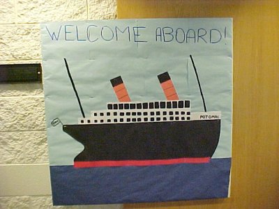
This was the first dorm bulletin board that I ever did, August/September 2001. This followed a building-wide theme that Mecca Marsh, our hall director, came up with: “SS Potomac“. I believe that I took the theme most seriously out of all of them (passenger ships have been an interest of mine for some time), and used life rings and ship’s wheels for the resident nameplates to follow the theme. My ship is in Cunard Line colors, i.e. red (orange) and black, with two stripes at even intervals along the funnels. I think that I was trying to base it off of the RMS Queen Elizabeth. But the hull is a little bit iffy when it comes to time periods. The bow is supposed to be raked (angled), but curves upward to become straight, like I couldn’t decide whether to go with 1910s styling or 1930s styling. Then the stern is a counter stern, which is clearly pre-World War I, whereas the Queen Elizabeth had a cruiser stern.
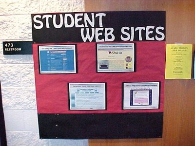
This was the “quick” bulletin board for August/September 2001, showcasing some JMU student-run websites. Just screenshot and print off. And yes, I absolutely went there: that is Schumin Web at top right. The content on the front of my site is the “Welcome aboard!” quote article from August 2001.
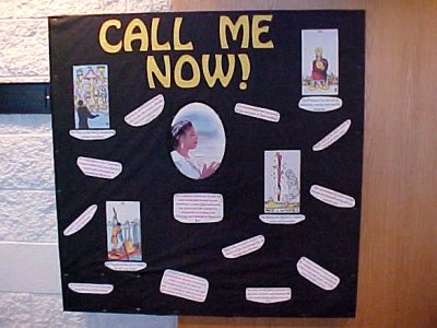
This bulletin board, from October 2001, is one that could have only been made in 2001. This bulletin board contained facts about tarot cards, and featured Miss Cleo, i.e. the lady from the psychic infomercials, and her “Call me now!” slogan, though the board otherwise had nothing to do with Miss Cleo. This was the first bulletin board of mine that had ever gotten vandalized, as someone decided to spit on the photo of Miss Cleo, and people did some other things to the board as well.
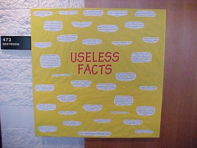
This was another bulletin board full of facts, also from October 2001. I got these facts from puzzlegrid.com – a website that still looks straight out of 2001.
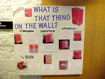
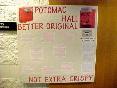
These two bulletin boards, both from November 2001, together discussed fire safety. The top one gave fire safety facts, and the bottom one discussed fire alarms that one might see around campus. Most of the photos came straight from Schumin Web, save for the one of the person holding the hammer on a Simplex station.
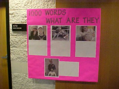
This bulletin board, from December 2001, was my first “interactive” board. I had taken these photos over the course of the semester, and invited people to put their own captions on them. The idea, unfortunately, ended up being a dud.
This was also the first bulletin board that I did that was covered in posterboard rather than butcher paper. I switched because posterboard had a bolder color palette, it was more durable, it was easier to transport on the bus (Potomac Hall was on the opposite side of I-81 from most of campus), and it was easier to install on site. Most importantly, removal was a snap, because the whole thing just peeled right off with a single stroke.
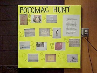
My other December 2001 bulletin board, which invited people to find certain things in the building, was done in the TV lounge rather than the hallway. I supremely resented that.
What had happened to place that board in the TV lounge was that several of my boards had been vandalized over the course of the semester. Remember how I said in 2016 that the problem with Mecca Marsh was that we never knew which version of Mecca we were going to get? This was an instance where Mecca made my job a whole lot harder. I asked her to come and speak to these people during a meeting in order to make the bulletin board vandalism stop, i.e. a message along the lines of a stern reminder that it is not their place to modify the bulletin boards unless invited. Mecca did something else entirely and negotiated with the little terrorists. I was dumbfounded. The result of that discussion was that we would turn the front bulletin board into a community space, and my required board would be done in the TV lounge. I didn’t like it, but it was out of my hands. So when I changed the bulletin boards for December, I implemented what was determined. And then, rather than using that space for whatever they told Mecca that they wanted to use it for, somebody put porn on it. I saw that coming from a mile away, and was not surprised in the least to see that result. And then I would have to remove it whenever it appeared. The bulletin board that I did, meanwhile, bombed, because almost no one saw it (the TV lounge was not a high traffic area). By the end of December, I had told Mecca, point blank, that I was removing their “community space” and returning to the normal arrangement when I changed the boards again the following month. After all, the Internet may be for porn, but my bulletin boards were not. Considering that I got no resistance from Mecca to my rolling back her earlier decision, I’m pretty sure that she realized that she had made a mistake.
Then the January 2002 bulletin boards were pretty low effort:
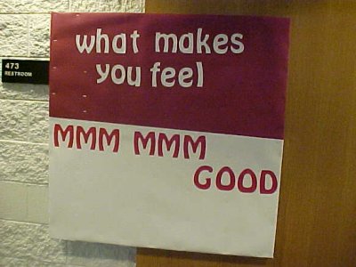
“What makes you feel ‘mmm mmm good’?”
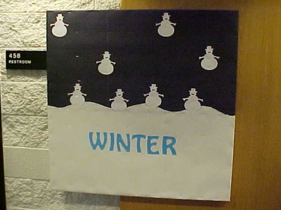
The winter one was intended to be taken at face value, and if I recall, the “mmm mmm good” one, designed to vaguely resemble a can of soup, was intended to be interactive, with the intent that people write what made them happy, but no one interacted with it. By this time, I had decided to put any interactive bulletin boards in the back half of the hall, because bulletin boards there tended to fare better than in the front part.
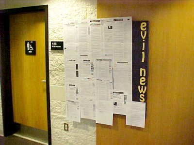
For February 2002, I put weird news stories up on this bulletin board, and updated it on a weekly basis. Because it changed on a routine basis, I got permission to keep it up for an extra month. I think that the only reason that this came down for April was because I got tired of updating it.
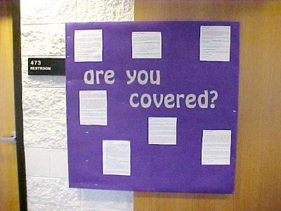
This one, also from February 2002, about safer sex, went through a few iterations before I eventually settled on this version. My original idea was to tape wrapped condoms to the board and say, “Be safe, take one”. When I ran it past the folks at the resource center for RAs, they strongly suggested that I not implement it that way, and it eventually ended up being a “facts” bulletin board about safer sex.
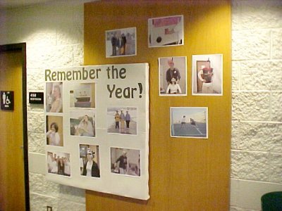
In April 2002, this was another “photos” board. It was the last bulletin board of the year, and I shared photos that I had taken of various folks in the building over the course of the year.
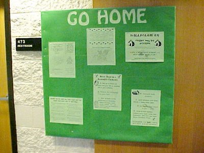
The other bulletin board for April was dictated by service needs, i.e. information about the dorm’s end-of-year closing. Pretty straightforward. The only things that I was responsible for were the background and the title. Everything else was, “Here, put this up.”
In August 2002, I started my second and final year as an RA. This time, instead of all freshman males, I had an upperclass hall that was both male and female. With a year of bulletin boards under my belt as one of two returning RAs in Potomac Hall that year, I felt more comfortable with putting up bulletin boards and had more fun with the boards, and I believe that the later boards were far more memorable than the earlier ones.
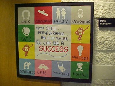
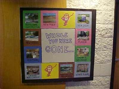
These two bulletin boards were what greeted everyone when the dorm opened in August 2002, and they lasted until the end of September. With no building-wide theme that year, I went for a theme based on the old game show Press Your Luck. Note the presence of the Whammy on something designed to look like the Press Your Luck game board. The Whammy was something of the mascot for the floor, because all of the nameplates for the rooms also displayed the Whammy.
That top bulletin board was pretty straightforward, showing things that had changed on campus over the summer. There was a new building on campus, a few things had gotten renovated, and the wooden “stairs of death” that ran between D-Hall and Godwin Hall had been replaced by new concrete steps. There were 66 steps on the old wooden stairs, but the new concrete stairs had 68 steps. Then the second bulletin board was to placate Mecca, who for some reason didn’t understand that the theme for my floor was based on an old game show, and rejected it, saying that “press your luck” wasn’t a very inviting term. So I came up with “With skill, perseverance, and a little luck, you can be a success” as the formal name for the theme. She ate that right up, and I did what I wanted to do in the first place.
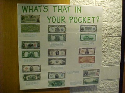
This October 2002 bulletin board was about old money. It displayed versions of US currency that were no longer issued, as well as larger denominations that were only used for transferring funds between banks.
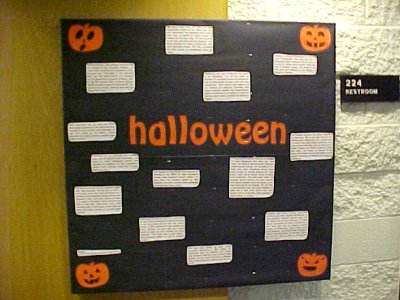
Facts about Halloween. Pretty straightforward. The pumpkin in the top right corner has the same design that my first grade class chose for our class pumpkin in 1987.
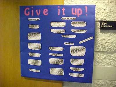
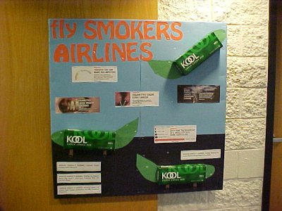
In November 2002, I did an anti-smoking theme for the hall. The top board showed the then-new graphic warnings used on cigarette packs in Canada, as well as the textual American warnings, e.g. “Quitting smoking now greatly reduces serious risks to your health”. The theme seems odd, but it goes with a comedic piece that had been circulating around on the Internet at that time. The plane bodies were empty cigarette cartons that I had gotten from the Sheetz down the road. Then the other bulletin board had a whole bunch of tips on how to quit smoking and how to “stay quit”.
That top bulletin board got vandalized, which was unusual for an upperclass floor. I guess the smokers took it personally? While I had eventually resigned myself to the fact that my boards would definitely get vandalized on the freshman side, upperclass boards typically didn’t get vandalized. And I was pissed off about that, because that was my more artsy board, and I had put a lot of effort into making it. So for the next bulletin board, I went in for the kill:
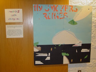
This was the easiest bulletin board that I ever did. I partially destroyed the previous month’s board and left it like that, with a note explaining exactly what had happened, i.e. that I did it, and why I did it. The whole thing took five minutes to do. This beat the pants off of Mecca’s go-to response for vandalism, where she had us post the definition of “respect” on the board on a piece of paper. My tactic, unlike Mecca’s, worked like a charm, because I never had another instance of vandalism for the rest of the year.
Then in January 2003, I came out in full force. Out of all of the bulletin boards that I did, this was definitely my favorite:
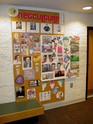
This was my “Netculture” bulletin board. I found a bunch of flash animations on the Internet, mostly animutations of some sort, and then used a graphics program to chop them up and make this collage of sorts, that covered not only the bulletin board, but also the wooden accent panel behind it. I took graphics from Hyakugojyuuichi!!!, Rubber Duckie, Dash, Irrational Exuberance, All Your Base Are Belong To Us, Mario Twins, an Afghanistan-themed take on the “Banana Boat” song, Mr. Nice, Gonads and Strife, the Japanese Hi-HO commercials from Panasonic, and probably a few other things that I’m not remembering. Basically, the early 2000s Internet threw up on the wall. I was sad when I inevitably had to take it down.
By the way, if this bulletin board sounds familiar, I wrote about it before in 2005.
The other board for January was a bit more educational, though less visually appealing:
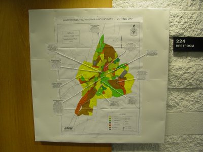
This was a zoning map of Harrisonburg, Virginia. There are notes around the map with lines pointing to various features, explaining the map in more detail. Some of these correlate with the things depicted in “The Third Walk” in College Life.
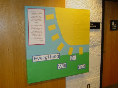
I still don’t understand why I made this bulletin board. It shows grass, sky, and a big, yellow sun, with the words “Everything WIll Be Fine”, along with the lyrics to a song that starts the same way from Today’s Special. I remember not being pleased with how that sun came out. I put it up during a massive snowstorm, and so I’m pretty sure that this board, as well as the next one, were made using materials that I already had on hand due to the aforementioned snowstorm.
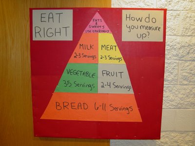
The companion to the sun bulletin board was this one with the food pyramid. I remember being a bit disappointed with this one as well, and I think that a lot of it had to do with its turning out somewhat lopsided. It also was what replaced “Netculture”, and so I suppose that, to a point, it didn’t matter what I did in that spot, because I knew that it wouldn’t be able to top “Netculture”.
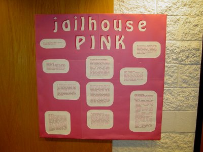
This board, from March 2003, was a simple design, but the learning was a lot of fun. It was about “Baker-Miller pink“, a specific shade of pink that was used in jails for its calming effect on those who were placed in rooms painted that color. The background color was whatever pink posterboard that they had at the resource center, but the text was printed in the real Baker-Miller pink color.
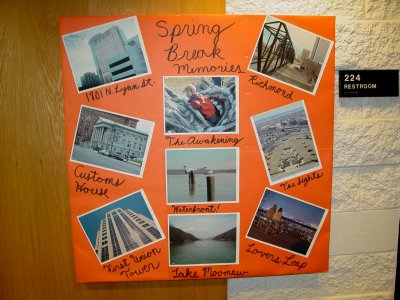
This bulletin board was a disappointment, because I had the rug pulled out from under me at the last minute. It was not my intention to make this a Schumin Web bulletin board. Rather, I wanted to do an interactive bulletin board, and have my residents post their spring break memories, rather than me posting my own. But then Mecca, in all of her infinite wisdom, decided that because of the pending start of the Iraq War, that we would no longer be allowed to do interactive bulletin boards. Well, crap. I had already gotten the materials for the original idea, and didn’t have time to go back and redo it all, and so rather than have my residents’ memories on there since apparently, they couldn’t be trusted because politics, I filled it with photos from my spring break. I really resented having the rug pulled out from under me, but it was outside of my control. It also made it look like a big shrine to myself, rather than something more communal as intended.
By the way, if these photos look familiar to you, they should. These shots would eventually be used in the An Urban Comparison, The Awakening at Hains Point, Alexandria Waterfront, Lake Moomaw, and Mill Mountain Park By Night sets in Photography.
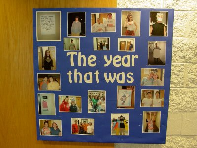
This one was fun. It was the last bulletin board that I designed, and, like the previous year, was photos that I had taken of everyone over the course of the year. The title came from a Tom Lehrer album.
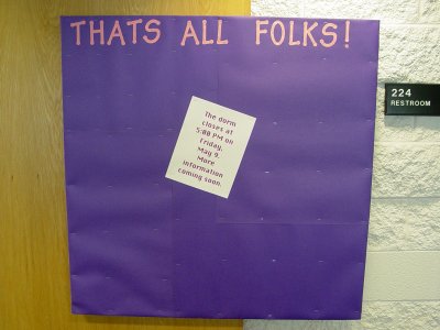
This was the absolute last bulletin board that I did in Potomac Hall, and it was about the end-of-year closing. The intent, as per instructions, was to leave it mostly blank with more detailed information to be added later. That never happened, as most of us emailed our information out rather than posting it up on the bulletin board, but you know, we did as we were told.
Meanwhile, the use of “dorm” instead of the preferred term of “residence hall” in this message was deliberate. At that point, Mecca Marsh and I had a pretty poor working relationship, as Mecca had made some statements in my final performance evaluation that completely destroyed any trust that I may have still had in her. If it tells you anything, I escalated my concerns about what she wrote to her supervisor, and following review, the statements were retracted. My use of the word “dorm” was my little way of saying “f— you” to her, because I knew that she would see it.
Each floor also had an information board on them, and most notable there was in the spring semester 2002, I did it up resembling my employer back home, Telegate. It said “The 11880” (their information number) on it, and had various notices and flyers on it. Then near the end of the semester, I got laid off from Telegate when our call center closed. That was the end of that board, as I went in and removed all of the lettering, leaving only the background paper with labelscars from the now-removed lettering. I think I needed that little bit of closure that removing the letters provided, similar to how I scrubbed Food & Water Watch’s name off of my water bottles in 2013.
So those were my bulletin boards. They were definitely the work of a much younger man, but they did the job, and, for the most part, I had fun making them.
Categories: JMU


