The remodeling of a Walmart store…
5 minute read
February 19, 2020, 4:33 PM
Back in 2005, I was living in my parents’ house and working for Walmart. I tended to go out a bit after work in order to unwind, and when I did, I would usually do a circuit that took me from my store in Waynesboro up Afton Mountain, down the Blue Ridge Parkway as far south as Route 60, go west on Route 60 to Lexington, and then head back home via I-81. When I did this, the Walmart in Lexington tended to be one of my stops, as it was a logical place to get up, walk around, and shop if I needed to (I didn’t like shopping at my own store because I didn’t feel like a customer there, nor was I treated like a real customer). For a few months that year, Walmart remodeled that store from the late-1990s design that it was given when it was expanded to a Supercenter to the then-current store design, which was the mid-2000s black signage with brown walls. For some reason, I documented this remodel throughout the process via cell phone photos. So here it is. Forgive the quality, because cell phone cameras at the time didn’t take much better photos than a potato, and using Big Mavica would have been too obvious.
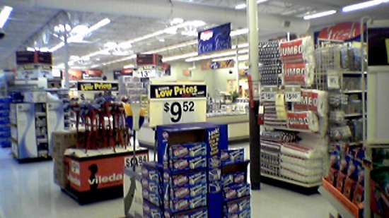
Prior to the remodel, the Walmart in Lexington was a typical 1990s pylon-style Supercenter, with a gray and blue color scheme, and late 1990s signage.
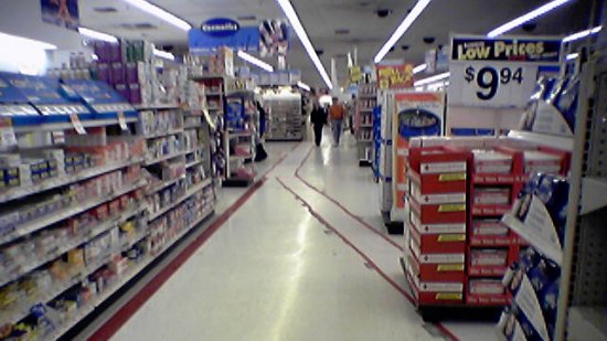
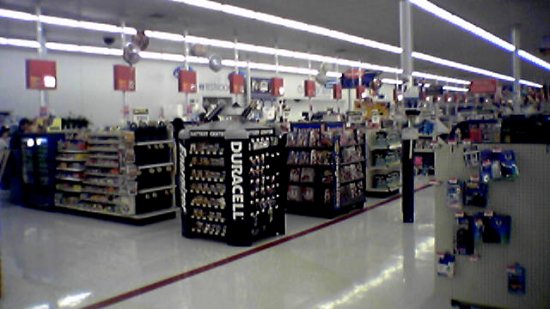
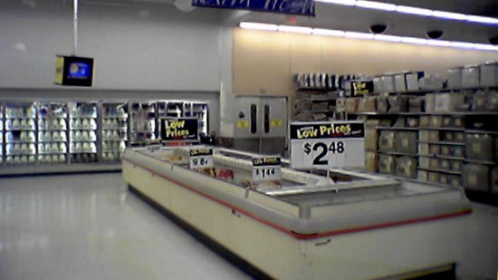
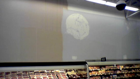
Early work was mainly painting walls and replacing floor tile.
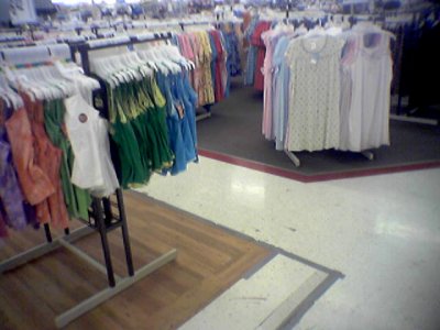
In the clothing areas, the carpeting was replaced by wood-look tile. Interestingly enough, I learned from working at Walmart back then that the color of the carpet was chosen because it was the same color as most stains. The wood look is definitely an improvement.
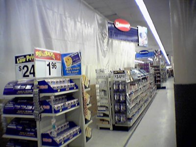
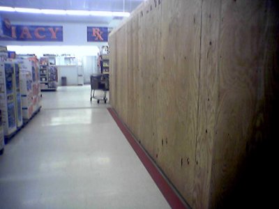
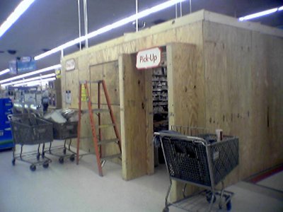
Pharmacy renovation. The pharmacy was moved into a temporary structure on the salesfloor while the regular pharmacy space was renovated.
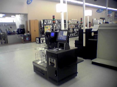
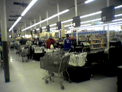
The new front end replaced the old color scheme with blue registers and red numbers with black, and introduced self checkout machines for the first time. The self checkouts were IBM models.
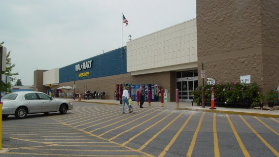
By a month into the remodel, the exterior of the store was painted different shades of brown and tan, and the red stripe around the middle of the building was completely painted out.
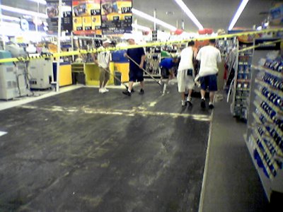
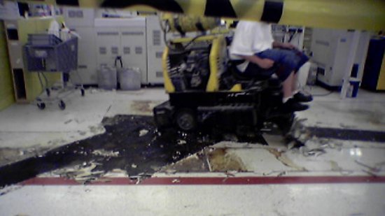
Tile replacement in action. Crews used a ride on machine to scrape the old tile off of the concrete, and then laid new tile. The old tile had gray flecks, and the new tile had brown flecks. Additionally, all red lines on the salesfloor were done away with.
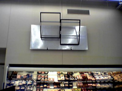
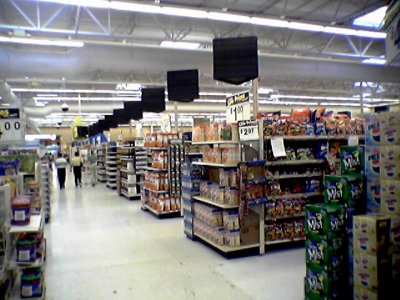
New black wall and aisle signage going up in the grocery section.
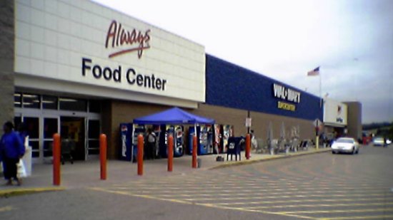
The exterior signage is complete, with mixed-case text, and the addition of “Always” text over the entrances.
And then the remodel was complete:
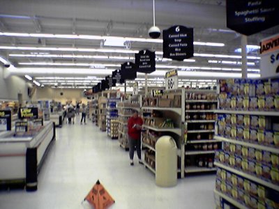
New signage is all installed in the grocery section.
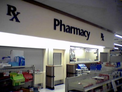
The renovated pharmacy is once again in service.
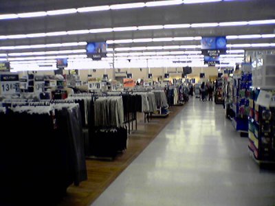
The clothing area, with new wood-look tile and signage.
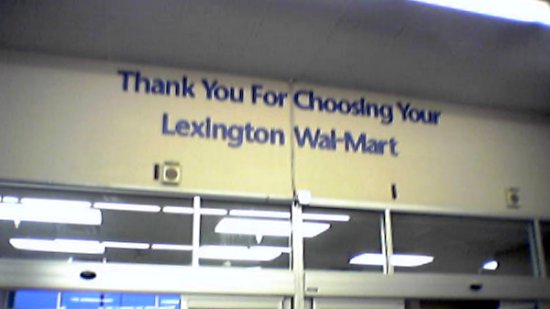
New lettering over the entrances.
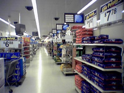
New aisle signage. This remodel brought a sign over every single aisle, listing what it contained, greatly aiding navigation in the era prior to smartphones.
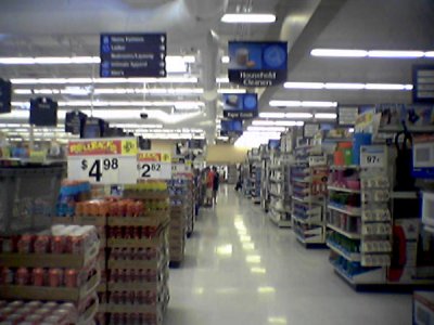
All in all, not a bad remodel.
Since these photos were taken, the Walmart in Lexington has been remodeled at least twice. According to Google Maps imagery, it is now wearing the current “Black 2.0” decor package, which has white walls and black signage. The floors are still tiled, unlike other stores that have done away with the tile in favor of polished concrete. Whether it’s because this store was converted to a Supercenter from a smaller store, I don’t know. And, interestingly enough, the cash registers and numbers from the 2005 remodel are still there, while the self checkouts have been replaced. Thus the front end is now a mix of black and blue, which is a tad jarring. But that’s Walmart for you, I suppose.



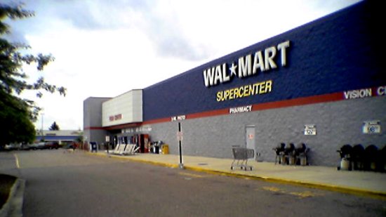

I’ve been to this very Walmart! The last time I went was in May 2021, and they were replacing the registers with self-checkouts and were jackhammering the front end when I was there. So interesting to see what it looked like two or three renovations ago.
I was there most recently in December 2021, and the remodel was complete by then. I wonder if what they were jackhammering up front was to install the “Grab & Go” section. This was up front next to the grocery door:
https://www.flickr.com/photos/schuminweb/52069661998
All in all, the store looks quite nice in its newest form, though I admit that I don’t like the Walmart logo in vertical format instead of horizontal on remodels. I imagine that the vertical logo will look fine on new stores that were designed for it, but they should have left the horizontal logo on existing stores.
You’re right, it was definitely the grab and go section! it looks like they have the airport style signage now too. When I went it was still the older style of interior. I went to Lexington for my brother’s graduation a year and a half ago now, and the first night we were there we needed to go to Walmart late in the evening, and I just remember being practically blinded by the bright bright white lights inside, reflecting off the white walls and floor tiles when we were walking in, which was shocking when coming from outside at 10 PM. I agree about the vertical logo. On newer stores I’m all for it, but on older ones like Lexington it’s a bit odd to see the juxtaposition of the pylon style with the new design element of the vertical logo.
I really appreciate and admire what you do with posting photos of Walmarts across the country and your insights on the company. I wish I discovered your site sooner! It’s so interesting seeing as this company is a backbone of America, but people barely document the constantly evolving exterior and interior of a place that millions of people visit every day. I love coming across old photos of Walmarts and other nationwide chains, it’s like finding a piece of ephemera you can look back on.