On August 6, Elyse and I headed out to Chantilly for BrickFair, which is a Lego show held at the Dulles Expo Center. This was my second time going to BrickFair, following my previous visit in 2018. Like in 2018, I had fun, and I photographed a lot of Lego creations with my phone, while Elyse checked out all of the vendors. I am always impressed with what I see at these events, because it puts whatever Lego creations that I made back in the day to shame. My stuff was decent, and I always took pride in the way that I engineered things to work with the parts that I had available, but this stuff is worlds beyond anything that I ever did.
There was so much to see here, and while I got around to all of the tables, I definitely didn’t see everything there, because there was just that much to see, and we had only budgeted four hours. Here are some of the highlights of what I saw:
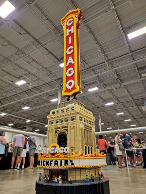
The Chicago Theatre.
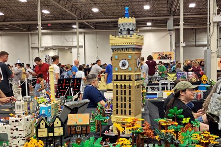
The Bromo Seltzer Tower, a landmark building in Baltimore.
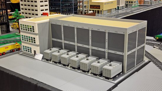
A data center building, similar to the one that Schumin Web is housed in out in Ashburn.
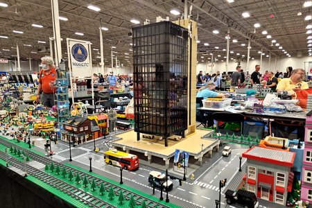
6320 Augusta Drive, a 15-story office tower in Springfield, Virginia. Elyse and I have been to this building a number of times in the past, and Elyse has filmed the elevator there. Also notice the Fairfax Connector bus out front.
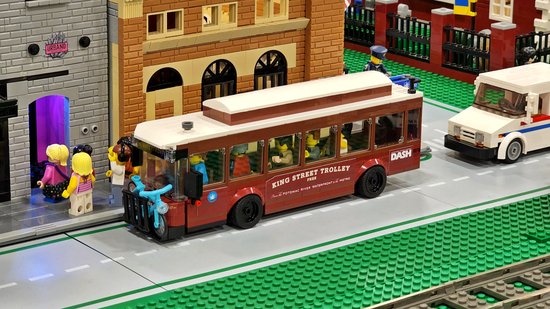
The King Street Trolley, a DASH service that operates in Alexandria between King Street Metro and Old Town Alexandria.
A New Flyer Xcelsior XD60 bus in New Jersey Transit colors.
These two photos are details of a piece called “Lizard People” by Amber Niblock. The top level showed a politician with green hands speaking at a podium, and then underneath was this scene, showing a bunch of anthropomorphic lizards, presumably calling all of the real shots.
A Fletcher-class destroyer by James Beute. This was the first of many ships that I saw today.
The HMHS Britannic, the younger sister ship of the Titanic. This ship never saw passenger service, serving as a hospital ship during World War I. The ship sank in 1916 after striking a mine in the Aegean Sea. Unlike most other Olympic-class ships in Lego seen here, this one was built entirely from scratch, and did not use the Titanic model as a base.
This one was called “Titanic II“, described as “A space-ified rework of the Lego Titanic set.” It used the Lego Titanic model as a base, and was then modified with space-like things to make it look futuristic.
This piece is called “Titanic under construction” and was built by Kevin Darke. This depicts Titanic on the slipway at Harland & Wolff prior to launch, though after the Olympic had already been launched, and uses the Titanic model as a base. I picked out a whole lot of errors between this and what the Titanic would have actually looked at the time of her launch. In this case, the ship here is much more complete than she was at launch, with the bridge fully built. Additionally, many modifications that were made during fitting out based on the company’s experience operating Olympic are shown here, such as the irregularly-spaced windows on B-deck, the enclosed forward end of A-deck, and the bridge cabs that extend past the side of the ship.
The Space Shuttle Discovery, in Lego form.
This is Point of Rocks station in Frederick County, Maryland. Elyse and I have been here plenty of times in the past, for trainspotting and drone photography.
Lego freight railcar done up with the Lego space logo, called the Extrasolar Shipping Company, with reporting mark ESSCX.
One thing that amused me was seeing all of the branded stuff, i.e. the stuff that used the brands of real-life companies. None of these were made by the companies named, and it was interesting to see all of the different interpretations of the various companies.
This one depicted a 7-Eleven, and was called “Night Riders”, described as, “An underground racing scene meeting late at night.”
This one depicted a 7-Eleven store as well, and was fairly accurate both inside and out.
Five Guys store. While Five Guys doesn’t have its own standard architecture, the interiors of their locations have a distinct style. I was pleased to see how accurate the inside of this one was.
Brick-fil-A, an obvious spoof of Chick-fil-A, using Chick-fil-A’s standard architecture. I commented to the guy that for the next day, a Sunday, he should remove all of the people from the restaurant and make it look like the place was closed. He responded that this was Brick-fil-A, and not Chick-fil-A.
Another Chick-fil-A, as well as IHOP. I was particularly impressed about how faithful it was to IHOP’s standard architecture.
Pizza Hut location, with classic styling.
Connor Franco of Manorville, New York built a Lego Walmart store. I’d say that they did a good job, because it looked like Walmart, with all of the right colors, the Subway restaurant, and other various things.
Angry Birds on an iPhone.
This creation by Daniel Zimmerman was titled, “Functioning Vinyl Record Player”, and it was exactly what it said on the tin: it actually played real records.
Lastly, a basket containing a Lego hamburger and fries.
And there you go, I suppose. This overview barely scratches the surface of what was there, but there was so much stuff there that it would take ages to show it all. All I know is that I enjoyed myself while I was there, and so did Elyse. Hopefully my schedule works out again so that I can go next year, but we’ll see.