


The future of the past…
19 minute read
June 27, 2024, 6:32 PM
Recall back in December that I spoke of the need to redesign this website in order to take advantage of various new features and functionalities that I’m not currently making good use of. Lately, unfortunately, I have not made any headway on that due to my being backlogged on new content. It’s like Jon Taffer of Bar Rescue fame once said, where an owner was too busy working in their business to be able to work on their business. However, I did recently take a look at screenshots and other materials for various concepts from past redesign efforts to serve as some level of inspiration, and while I didn’t feel particularly inspired by these old concept designs, I thought it might be interesting to share them with you, to think about what Schumin Web might have looked like had I gone further with these various ideas rather than what I ultimately opted to go with. I don’t regret not going with these various concepts because a lot of these were just explorations, but I definitely learned something about the site with each iteration.
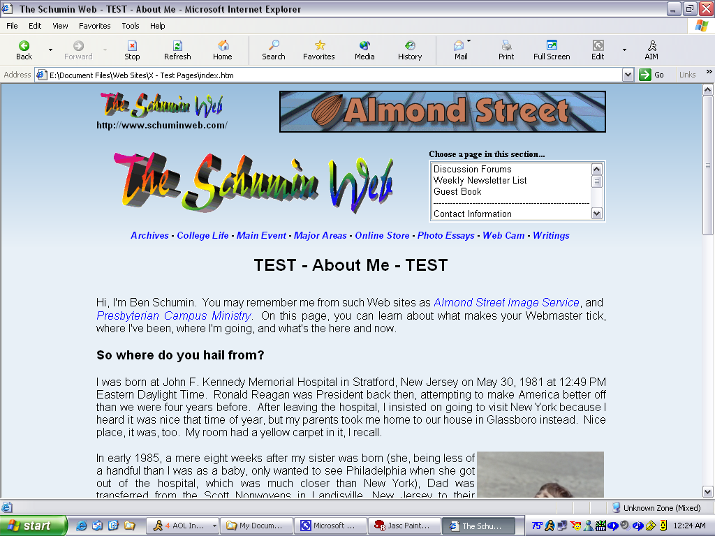
First, recall that before the current “Modern Blue” design, which was introduced in 2012, I had been using a design that I had called “Faded Blue”, which was introduced in 2004 and was later modified into “Blue Squares” in 2008. One new thing back then was that the advertising banner, which had previously been at the bottom of the page, would now be at the top of the page. The first concept for that design was… not good. Here is the initial concept for the Journal:

As I recall, my thought process was, “Let’s put a big banner advertisement in there!” in order to maximize interaction and hopefully get a little extra money. I think everyone understands why I didn’t go with this concept, though. That large banner was simply too big for the space that I was working with, and if we’re going to be quite honest, it crowded out the logo.
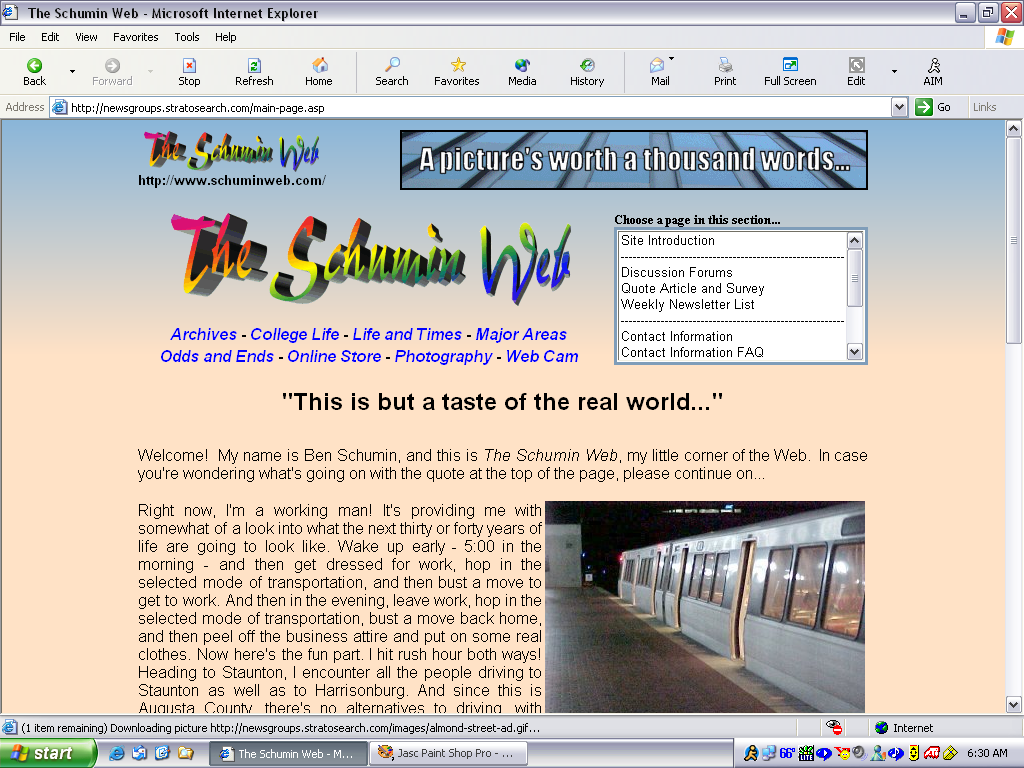
This is a later concept, which is closer to what I ultimately ended up going with:

All I can say is, much better. This concept was 99% of what ultimately was published, with only the final link treatment’s not yet being determined. Note the underlining and purple colors. The final version dispensed with the underlining and did away with the purple link color.
That was back in 2004. By 2011, that design was starting to be a bit long in the tooth, even with the refresh to Blue Squares. It looked like the work of a much younger man, and I was starting to feel the limitations of the format. I had already rebuilt the site with this same design twice: once when the site moved from Windows hosting to Unix hosting, and then again when I finally learned how to do CSS. Now, I was looking to convert the site over to WordPress, and that would mean rebuilding it all once again. We all know how the story ultimately went on WordPress: I wanted to move forward with converting the site to WordPress but still didn’t have a new design to introduce with the new content engine, so rather than delay the WordPress work until I came up with a new design, especially since I was only just learning how to build WordPress themes, I opted to split the baby, creating a theme that looked like the existing Blue Squares design, with only minor modifications. That also helped me learn how to do themes more easily, since it eliminated a few variables. Instead of learning theme design and creating something new, I could just focus on learning theme design by recreating something that already existed, and then, with a better understanding of theming, I then could be creative later.
But getting there was a long slog. I tested so many concepts along the way, from simple modifications to some more radical changes. The first thing that I tested was in 2011, where I tried a full-width photo feature on the main page. The idea here was to allow photos that had a 16:9 aspect ratio to be featured on the main page. Originally, when the photo feature was introduced on the main page in March 2005, it could only hold a 3:4 aspect ratio. This was modified in July 2006 to accommodate a 4:3 aspect ratio as well as 3:4, and a photo of the fountain at Malcolm X Park was the first to run in this aspect ratio on the main page. However, later on, I started publishing more photos as 16:9, and wanted to see how it would fit. This is what I came up with:

It was… not good. The problem with it was that the wide aspect ratio would have made it too short if I tried to put a sidebar underneath it, so it had to go in full-width. To give you an idea, if I ran a 16:9 photo feature in the space as it existed back then, it would have looked ridiculously stumpy (and truth be told, it would still look stumpy if I did that on the present-day site design, too). Making it full-width meant that the sidebar had to go underneath it, and that just didn’t look right. I also didn’t like the idea of having a radically different version of the main page for a third aspect ratio. At the time, the main page already had two versions: the one for a 4:3 that utilized the whole space, and a separate version for 3:4 that utilized an inconsequential sidebar in order to fill some side space. That’s sort of a byproduct of why the photo feature was vertical-only at first, because there used to be a sidebar menu on the left side with the photo feature, which was a holdover from the Quote Article days. I eventually decided that the sidebar menu was unnecessary, which cleared the way for the horizontal images. But since the feature wasn’t boxed in like it is today, a single vertical image would have made the page look lopsided. Thus I made a sidebar that could be called up as needed to make the page appear full when I had a vertical photo feature, and not have it when it wasn’t necessary. As I recall, I used a switch in the database to trigger it. A full-width version would have been called up with a database switch, and the page would have shifted as necessary, but it was just too much of a change, and I feared design whiplash, with such a big change going back and forth. So the idea was dropped, and I still won’t run a 16:9 photo on the main page. Go look through the archive if you don’t believe me. As of this writing, there has never been a 16:9 photo feature, and that’s not likely to change in the foreseeable future. Most photo features these days are in a 3:2 aspect ratio, but let’s not get ahead of ourselves (it will be relevant later).
The first real effort towards a redesign was in 2011, when I pulled out a piece of a paper and a Sharpie and started doodling:

This was the very first concept that led to Modern Blue, where I sketched up the Million Worker March photo set from Life and Times. And yes, I really did write some lorem ipsum in there by hand.
It’s funny how many people don’t seem to understand why my concept designs tend to mock up random pages throughout the website, rather than the main page or something else like that. I had a colleague at the time question why I would put that as the first page on the site, and I was like, “No, no, this is an internal page.” The thought process seems sound enough: more pages look like a random photo set page than like the main page, so mock those up first to get the concept, and then once the concept is settled upon, make a main page to go with it.
This one tried a few different things. It retained a left-hand sidebar from the Blue Squares design, but it also introduced a clean header at the top of the page, doing away with the advertisement in the header. The advertisement moved to the right side of the page, which seemed reasonable enough. I also put the section titles above the header.
Satisfied with the doodle, I then worked it up on the computer:

Imagine if Schumin Web had looked like that. I found it hard to imagine, both then and now. I clearly treaded lightly when placing colors on this, as I retained the square pattern from production, and maintained similar colors. The new masthead featured a photo of the Kennedy eternal flame, and used a test logo that I called “daisy wheel” because it was a photo of my hand arranged like a flower, which I’ll explain more about later. For what it’s worth, “daisy wheel” as a name was actually a subtle Today’s Special reference, where Sam and Muffy did four tracings of Muffy’s hand, to which Sam remarked, “You might think that Muffy’s crazy, but take a look: a mouse-sized daisy!” But considering that mine was eight hands instead of four, it looked more like a wheel, thus the name, having nothing to do with the printing mechanism of the same name.
Not particularly liking it on artistic grounds, I twiddled with the colors a bit, getting rid of the squares and replacing it with a very dark gray:

Better, but I still didn’t like it. It felt like it was a step back in designs compared to what I already had. So I went for a third version:

With this version, I darkened the color palette a bit, and also tweaked the sidebar menu. It looks closer to what I ultimately went with, but it still didn’t send me. Having the section links at the top of the page crammed right up against the tabs just looked weird, despite my high hopes for it. Figure that you have the navigation bar, the bookmarks bar, and then the tabs, it made the sections look like just another toolbar rather than part of the content. This was also back when all sorts of entities would make their own browser toolbars that you could have in your browser, so that just didn’t work.
So with that in mind, I regressed things a bit and modified the existing design:

Basically, I took the existing site design and just boxed it in, while retaining the tweaked menu from the third concept, and using a photo of Potomac Hall at JMU as a masthead image. I was unimpressed. That tractor icon at the bottom, meanwhile, was a joke based on a website redesign that my then-employer, Food & Water Watch, was doing at the time. They showed us all the redesign, and it had a stock image of a tractor on a big farm at the bottom of most of the pages. Someone remarked about that if you read the page all the way down, you get rewarded with an image of a tractor. Thus I added the little tractor as a good-natured spoof of that, but the tractor would have never appeared in any final design.
That, by the way, marked the end of the effort to redesign the site along with the conversion to WordPress. At that point, being fully unsatisfied with the results of my efforts, I opted to just retain the existing design and port it over. Thus my efforts went into that rather than something new and fancy, and then once the theme was complete, I spent a lot of time porting content over to WordPress. I would revisit the idea of a new design about a year later, after the WordPress conversion was complete.
So when I returned to the drawing board after the conversion was complete, things were different. I understood WordPress a lot more than I did previously, and I had also taken a year to think about what I might want to do in order to make it the way that I wanted. My first concept was solely an exploration, and never intended for production, designed to test an idea for a color scheme:


This is the Blue Squares design as it existed at the time, but with a differnet color scheme on it. It drew heavy inspiration from a concept stage that ShowBiz Pizza tried out, thus the “MAGIC” logo. It used a stock brick pattern as a background, with the website in yellow-gold on top of it. It was similar to the yellow color that I used here in the early 2000s, but not identical. This concept ended up not pleasing me, but it took me less than an hour to cobble together, since it was just modifying existing elements, so it wasn’t a massive time sink. The take-home lesson here was that while a color scheme similar to this worked in 2000, it was not something that I wanted to continue to use in 2012. And that’s okay, since fashion and tastes are cyclical.
My next concept was one that placed the sidebar on the right side. That went through two iterations. Here’s the first one:

This is starting to take the form of something familiar. The first iteration made a number of changes compared to what existed before it, and looking back at it now, it really wasn’t a bad look, even if it wasn’t amazing. In other words, I understand why I didn’t use it at the time, but I also don’t hate it. It resembles the current Modern Blue 2.0 design in that it has a lot of left-aligned headers and the masthead design at the top, but the design also didn’t feel very inspired. It looked like a fairly generic website that happened to have my branding on it.
Feeling unsatisfied with this design, I changed the color scheme a bit and rolled back a few elements, and came up with this:

Okay, then. It’s the same header as the existing website, with logo, URL, advertisement, and section bar unmodified save for a color change. The sidebar was now on the right, and while it felt more like Schumin Web ought to feel, it still wasn’t quite there.
I tried again a few days later, and I hit gold:


Now we’re talking. Modern Blue was born with this design. It didn’t look bad at all, even though it would go through another redesign before all was done. Big masthead with clouds and a photo of me at the top (or at least a gorilla for the prototype), a sidebar on the right side, and everything was boxed in. It presents a somewhat cleaner look than what I ultimately went with, and I like it nowadays for its clean look, compared to the somewhat heavier design that I ultimately implemented. Also note that the “daisy wheel” logo was back in place, using it as a stand-in for a potential future logo, since I was still determined to redo the logo at that point in time, though I had no idea what I wanted to do with that. The new-logo effort would ultimately fizzle for lack of inspiration, and the regular logo would be substituted in at the end of the redesign process.
This design seemed perfect, but it was missing one key element: an advertisement above the fold. There was one at the bottom of the page, but nothing up top, and those ads were part of what helped fund the site. So for that alone, this specific implementation wouldn’t work. However, it was so perfect otherwise that it convinced me to design for a wider screen. I had previously assumed a screen that was 1024 pixels across, which was a safe thing in 2004 before smartphones were commonplace. Now, I started designing for a 1280 width, which gave me more space for an advertisement, but was still somewhat conservative on purpose because I didn’t want to go too wide and look super tiny on phones.
But the take-home point here was that I liked it a lot. So now I had a new base on which to build on. The next iteration of the design would build on and refine things, and ultimately led to this:


Yep – it’s the final design, save for a few minor changes. I wrote about it at the time, soliciting feedback, and as I recall, the feedback was positive. The only changes compared to the final design were to swap in the regular logo, the color of the links (I got feedback to go with a different shade of blue for a more modern feel), Instagram was added to the social media button bar, and the placeholders on the sidebar were replaced with proper header images.
So that’s how we got to the current design, and all of the crazy explorations that I made in order to get there. More recently, though, I tested a modification to the main page for a bigger photo feature:

This was a quick and dirty change that I did in a graphics program. I wanted to eliminate the ad banner’s being the longest thing on the main page, so I made the photo feature bigger to compensate. The problem was that in order to get it the size that I wanted, the sidebar looked crowded. I submitted it for feedback on Facebook, and the result was generally negative. Ultimately, no change was made. The lesson here was that if I wanted to make the photo feature bigger, it would need to be part of a larger, more fundamental redesign.
I also still want to update the logo, because if it was dated looking twelve years ago, it’s very dated looking now. It looks like it’s from the nineties, because, well… it is. It needs a refresh, but I don’t know what I want to do with that, either. I have tested a few concepts over the years, though. One thing I did was experiment with color on the existing logo:
Of these, my favorites were the crimson, orange, and celestial blue versions. Pay no attention to the minor differences in the 3D treatment and letter spacing on some of the specimens, because these were just explorations with color, and as such, this was a quick-and-dirty test, i.e. it was enough to get the point across. If I had actually used one of these in production, I would have ensured that it all matched.
Then I also tried this one, which flattened the logo and included a drop shadow:
Interesting, though it looked incomplete compared to the 3D treatment.
All of these were interesting explorations, but were never given serious consideration. The rainbow color of the original still ruled supreme.
Then there was that “daisy wheel” logo that I mentioned earlier, which you saw in some of the design concepts. That was a complete new logo for the site that I designed in 2010. The idea was to make an image mark for the website, and so I thought about using my hand to form the basis of a logo. After all, the website was about me, and it’s my hand, so it seemed to make enough sense. So I started out by taking a photo of my hand:

I couldn’t help but think that my hand looked really chubby in that photo, but then again, I was really chubby back then. So I took that initial photo, and made a silhouette from it:

I then rotated it and made a point out of the end of it, coming up with this:

And that was the base of the “daisy wheel” design. Looking at it again now, “severed hand” is what immediately comes to mind. From there, I just rotated things around a bit and colored them, and that became my wheel:

One thing that I noticed right away was that while the outside looked okay, the inside looked very rough. Such is what happens when you try to cobble eight severed hands together, I suppose. They don’t go together neatly. So then I started thinking about what I wanted to use to cover that little bit of unsightliness. My first thought was to use a sunburst, plus tinker with the arrangement and colors a little bit. That effort ultimately produced this:

I suppose that the main takeaways here are that (A) did a decent enough job hiding all of the seams, and (B) it unified things to an extent. However, it also felt like it lacked meaning. It looked like a very abstract design, and didn’t represent anything in particular. I wasn’t feeling it. I couldn’t imagine its being used to represent Schumin Web to the world. I would have preferred to go with that flat logo with the drop shadow over this.
However, I wasn’t done with it yet. While I didn’t like the sunburst design, I wasn’t quite ready to give it up. I tried covering the center with text, and came up with some more designs. First this:
Then this:
That last one is the final version of the daisy wheel logo, which is the one that I used in the various concept designs for the website, mostly to signify “different logo” rather than the regular one. Though before I gave up on it, I did try it in place on the website, along with the sunburst. Here’s how that looked on the site as it existed at the time:


I think that we all understand why I did not go with this concept. I remember when I first introduced the rainbow logo, I put it into an existing website design, where it looked pretty good. This one, not so much. It didn’t have a “presence” in the space, which was really the final nail in the coffin for that logo as a serious contender to replace the rainbow logo. It looked better as a placeholder for the concept designs, but it wasn’t suitable for prime time by any means. I also need to go back in time and slap myself for running that November 2010 splash photo. It was just a terrible photo, no matter which way you slice it.
Then just for fun, more recently, I decided to play with the Bing AI image creator to see what it thought a logo for Schumin Web should look like, to see what I thought it would come up with as a concept. After all, we’ve had fun with AI in the past, so why not take it for a spin. In the past, I had mentally toyed around with the idea of using a pair of glasses as an image mark along with the hat that I usually wear, and so I gave it a few prompts. The first prompt that I fed it was, “Logo for The Schumin Web with a brown newsboy hat and glasses.”:
If nothing else, I suppose that it got the hat right in the bottom left image. The rest of it is very much not me, but I also didn’t tell it much about me. Just make a logo, and include the hat and glasses. It did the beard all by itself, though I’m sure that Elyse, as well as certain folks that comment on my photos on Facebook (Ed and Tristan, I’m looking at you) would just love the idea of my having a beard. But that’s not going to happen. Meanwhile, the top right logo, I couldn’t help but wonder when Clark Kent quit his job as a reporter and became a park ranger.
Then I gave it, “Logo for The Schumin Web. The logo should have a brown newsboy hat and a pair of glasses in it.”:
This was more in line with what I was thinking of. Hat and glasses together to form an image mark, along with a word mark. It’s not a bad look, even if the hat is the wrong style. I suppose that it’s inspiration for a future logo design, because this seems more like something for a movie set in the 1920s rather than a modern website. But that doesn’t look particularly terrible as a possible logo idea for “Schumiiin Weeb”.
After that, I threw “Logo for The Schumin Web. The logo should have a brown gatsby cap and a pair of glasses in it,” at it to get more ideas:
And we’re back with the beard. And the last image looks like a kid wearing a hat with Milton-style glasses.
Then finally, I said, “Logo for The Schumin Web, a website about a writer and photographer named Ben Schumin.”:
Interesting. I admit that I’m amused by the top left image, because while it has nothing to do with Schumin Web, let’s admit that she’s good looking. Then there’s the guy in the top right who looks like the stuffy, pretentious type who takes himself far too seriously, chewing on a pen. The bottom two, meanwhile, make me think of the 1950s or thereabouts.
At the end of the day, you know, they’re explorations. They’re ideas that might lead to something in the future. Or they might not. Who knows. Sometimes we can learn a lot from concepts that just didn’t make it out of development, and they can inspire future development. A perfect example of this was with 2003’s Blue Cream Fade design, and 2004’s Faded Blue design. When I redesigned in 2003, my initial plan was to have a blue background:
I think that I decided that it wasn’t colorful enough, and I ultimately went with more of a cream color in the final design. It worked, and it was certainly a good enough look for its time. But then when I was redesigning in 2004, I looked back at the concept design, and decided that the lighter color scheme was what I wanted to go with, and so in 2004, that color scheme was adopted in its entirety for the new design. And if anyone’s wondering about the origin of the current color scheme, it is based on the “Potomac Blue” color that Metro uses on its seats.
So there you have it, I suppose. A cornucopia of test concepts, documenting a past future of Schumin Web that never would be, but helped blaze the path for what did or might come after it.
Categories: Artificial intelligence, Schumin Web meta
Leave a Reply