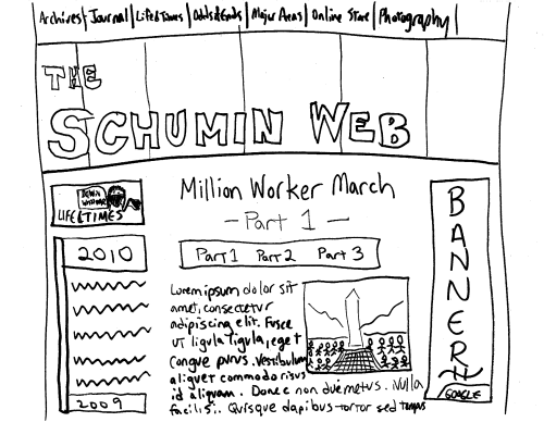
So how would you react to a Schumin Web that looked something like this?
2 minute read
February 18, 2011, 11:15 PM
In my quest to reinvent how Schumin Web looks and ultimately port it all over to the WordPress platform, I did some doodling this evening and came up with a design concept:
This design would put the section navigation at the very top of the screen, above a large, full-width masthead graphic, which would contain the logo, in front of graphics that kind of indicate what Schumin Web is about. Or rotating. I don’t know what yet, but I do know that I drew the masthead a bit taller than I intended. I would expect a final design version to still be full-width, but shorter than what I drew up.
Then for areas below the header, I’m thinking about keeping the navigation on the left, and placing advertising down the side on the right with one of those “skyscraper” ad boxes. Then the main content panel would be centered between those two side boxes at roughly the same width as it currently is.
This also begs the question: How wide do you design for? According to Google Analytics, all but 12% of my viewers look at the site on resolutions of 1280 pixels across or higher. 12%, however, still view in 1024×768, which makes me wonder if it’s okay to design for the 1280 width, or if I should stick with 1024. In my “designs I like” folder, Just Up the Pike has a masthead that’s 970 pixels wide. But then City Block, another design I like, has a design that tops out at 1050 pixels across. It doesn’t help that the sites that I like go under and over. I guess the question is whether or not I’m willing to tolerate a horizontal scroll bar on my netbook.
So I’d like to know what everyone thinks about this as a potential design. I have no idea what kind of colors would go on a design like this, nor about any little stylistic details, like rounded corners, square corners, and what have you. This is just to give an idea of where the walls might potentially be to define the various “rooms”. We haven’t picked out the crown molding just yet, nor have we looked at paint samples. All in due time, I suppose.
But hopefully, this will help steer the idea of a newer, more modern-looking Schumin Web. No one will again call Schumin Web “kinda 90s”. But I also want the site to still be me, and not look generic in its appearance. So let me know what you think, and perhaps this will end up as a final design. You never know, I suppose…
Web site: Opinions on how wide to design for when building a site
Song: "I am the man who arranges the blocks..."
Quote: By the way, for those wondering about some of the content details that I drew in, the picture in the content panel is supposed to be based on this photo from the Million Worker March photo set. Then the Life and Times section header shows a person in full black bloc (see the little hoodie and mask?), holding a protest sign in one hand (it says "DOWN WITH WAR"), and holding a something-and-black flag in the other hand.
Categories: Schumin Web meta


