Historical Site Designs
 In order be able to fully understand where we are today, one has to explore where we’ve been. The Schumin Web was launched on March 23, 1996, and in more than a decade of presence on the Internet, the design has continuously evolved as I’ve learned new techniques, changed styles, expanded the site, and periodically redesigned in order to incorporate a new look and make changes.
I first started paying attention to site design as an element of the site’s history in 1999. Before that, site redesigns were done every few months, and considered kind of throwaway – pictures of site designs were not retained. From 1999 to 2004, the site was fully redesigned annually. From 2004 to 2012, the site maintained a similar design, while changes came more incrementally, tweaking the style and introducing smaller improvements over time. In 2012, the site was again fully redesigned.
On this page, my intention is to display some of the various historical site designs that Schumin Web has used, and comment on what each design brought.
March 23, 1996
Site Launch

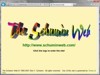
The Schumin Web launched on March 23, 1996 as Ben Schumin’s Home on the Internet. It launched with four pages, consisting of the home page, a “News of the Week” page, an “Information About Me” page, and a page of links.
For all that people say about quality-of-content vs. quality-of-design, the original design focused entirely on content, with next to no emphasis on style. The design looked very crude, but outside of an AOL “My Home Page” generator, this was my first attempt at making a Web site. And it seemed to work for the most part.
Fall 1996 – September 1999
“Frames” era
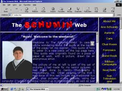
In the fall of 1996, I implemented framesets. The site design depended on a frameset to work, with the design usually involving a frame for navigation and another frame for content, and sometimes a third frame for a header. Several designs came and went during this period, with varying colors and arrangements. The design shown here is from fall 1998, not long after the transition to the name The Schumin Web.
During this period, the site carried several names. From September 1996 to September 1997, the site was called Ben Schumin’s Internet Command Center. Several site designs were used during this period. From September 1997 to July 1998, the site was called The Great American Road of Ben Schumin, and was accompanied by a highway-themed design. From July to October 1998, the site was called The User-Friendly World of Ben Schumin, and incorporated a predominantly blue design. The site became The Schumin Web in October 1998, as part of a redesign to correct what I perceived as a bad design with the “User-Friendly World” design.
This period introduced the quote article in the fall of 1998, and the current rainbow logo was added in July 1999, replacing the oddly-angled block letters used previously.
September 1999 – September 2000
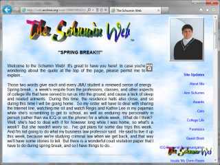
First “frameless” design
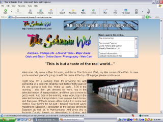
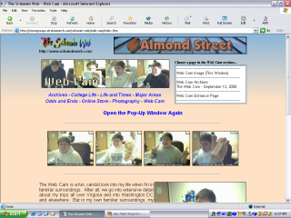
In September 1999, the site broke free of frames. The site was originally a very light brown color, and later changed to a blue-and-white clouds background. Navigation was accomplished via a single menu on the right-hand side of the page. During this period, I got my first digital camera, and pages that would later form the original Photography and College Life sections were introduced. This period also introduced a Web Cam feature to the site, which operated from 2000 to 2003.
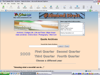
I first became serious about archiving content during this period, establishing the Quote Archives, and posting site updates. These would later form the Archives section.
September 2000 – June 2001
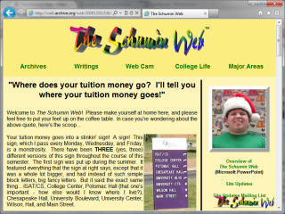
Introduction of sections
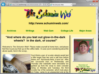
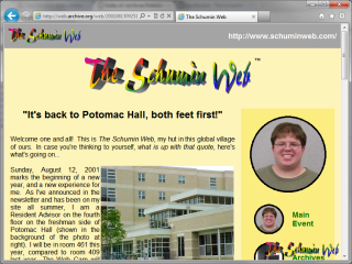
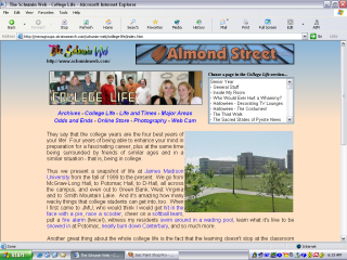
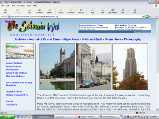
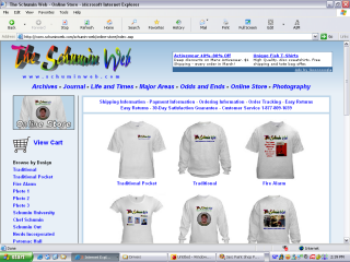
By September 2000, the existing navigation structure, consisting of a single sidebar, had reached its limit. It had become too long, extending beyond the end of the content panel on many pages. To rectify this, the site was organized into sections for the first time, and a number of older pages were retired. The original sections created were Archives, College Life, Main Event (now Odds and Ends), Major Areas, Web Cam, and Writings. The site took on a yellow appearance with green hyperlinks, and the www.schuminweb.com domain was introduced with the launch of the redesigned site. Additionally, the Online Store was introduced shortly after this design premiered.
Midway through this design’s lifecycle, two significant changes happened. First, I began to wear glasses, which triggered a change in the photo of me in the top right corner (the introductory photo of me was not changed monthly at that time). Secondly, the site’s URL was added beneath the logo in large type to advise visitors of the new address, as SimpleNet, my host at the time, had made efforts to discontinue the use of subdomains for their hosted sites and move people to full domains, and so I took advantage of the incentives that they provided at the time to facilitate this effort, and brought schuminweb.com into existence. SimpleNet had a permissive period where both the subdomain and the domain would work to access the site, and while I immediately changed how I marketed the site to reflect this new URL along with the redesign, I sort of shoehorned the URL into the header in order to make sure that people knew that schuminweb.com was the site’s proper address as the end of the permissive period drew near, and then removed it after the permissive period ended, and schuminweb.com became the only valid URL for the site.
Subsequent designs have included the site’s URL in the header, though the implementations were more elegant, due to their being incorporated into the design from the outset. The 2000 design’s incorporation of the URL looked like it was shoehorned into an existing design, which is exactly what happened.
June 2001 – August 2002
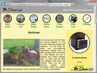
“Circles” design
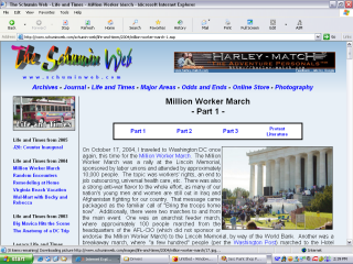
In the summer of 2001, the annual site redesign was a significant revision of the 2000 design. The site had the same basic color scheme and general layout, but it refined a number of elements. Visually, the darker yellow color now defined the navigation bar, and a gray header bar was introduced, carrying the site’s logo and URL. All of the section graphics were now in circles. Section navigation was directly beneath the header bar, with the exception of the main page, where the section headers were in the navigation bar. The sections themselves were also revised, as the Online Store and Photography (then “Photo Essays”) were split from Main Event. This design was later retrofitted for database-provided content in certain areas, which greatly simplified the editing of the site. This was also the last design to feature the site’s logo as a “bug” in the bottom right corner of the screen.
The site took on a slightly modified appearance the week after the September 11 attacks, as the gray navigation bar was temporarily changed to black in memory of those lost, and was accompanied by a quote article discussing the attacks. This design drew some criticism during the time that this modified appearance was in place, as I was writing a piece about a very serious topic, but the photo on the main page showing me smiling remained in place right next to it, which created some dissonance. That led to my separating the photo of me from the quote article in future designs, and only using a photo of me as a regular fixture on the splash page. I eventually restored the photo of myself to the site’s header in 2012, as the site had evolved to the point where that sort of dissonance would no longer occur.
Of the various historical Schumin Web designs, this one has always been a favorite of mine, as it was clean, cheery, and made good use of the screen for its time.
August 2002 – July 2003
“Minimalist” design
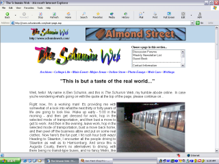
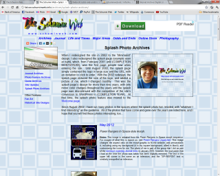
In August 2002, Schumin Web underwent another redesign. This design went for a minimalist approach, and was designed with the assistance of an impromptu online focus group (the first and last time I used a focus group for design). The header bar was light blue, the main background was white, and links were blue. The intent behind this design was to make a larger content panel while still fitting most screen widths in use at the time (the site design assumed a screen resolution of 800×600).
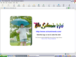
Site content was not significantly revised at the time of the redesign, aside from a number of new photo sets that were released along with the new design that were built to take advantage of the wider format that was being introduced. The section structure remained the same. This design also revised the splash page for the first time since its introduction in early 2001, reducing the logo’s size and adding a photo of me which changed monthly.
The navigation menu was changed in order to eliminate the sidebar to make room for the wider content panel. This new arrangement initially used two drop-down menus, with one for navigating between sections, and a second for navigating within sections. Days after the design launched, I revised this navigation structure after receiving several complaints about the initial design’s usability. The revision restored the section bar as a single line of text links, and enlarged the menu for navigating within a section, changing it from a drop-down menu to a scroll box.
July 2003 – October 2004
“Blue Cream Fade” design
The “Blue Cream Fade” design was a refinement of the earlier “Minimalist” design. This design responded to various complaints about the earlier design, as viewers said that the design incorporated too much white and needed more color, and that the navigation box was too small. This design addressed those design flaws by adding a colored background, and replaced the header bar with a fade. The sections bar now spanned two lines, in order to make room for a larger navigation box. The result addressed the named deficiencies, but the result led dual headers with an overall crowded appearance.
This was also something of a transitional design, as I would graduate college midway through this design’s lifecycle, and this was planned for during the redesign. As such, it introduced Life and Times as a successor to College Life, and was the only period where these two sections would coexist, as the goal was ultimately to pivot the content away from college, and make a new section that was in the same spirit as College Life, but be more sustainable as an ongoing feature. This design also dropped the “Writings” section, as that section had not been added to in several years and had become somewhat dated. With no prospects for future additions to the section, it only made sense to drop it. Additionally, the section previously known as “Main Event” was renamed “Odds and Ends”, as the site had evolved to the point where this section no longer warranted being more prominent than other areas, and became coequal with the other sections for the first time.
Life and Times, however, had a bit of an identity problem early on. The original photo sets for Life and Times had been transferred from the newly-renamed Photography section, as Photography’s scale was defined to be more about straight photography, while the sharing of life experiences would occur in the new section. The Journal was also introduced as a feature of Life and Times in place of a formal introduction page, in keeping with the idea of sharing my life and times. As first implemented as part of Life and Times, the Journal displayed the five most recent posts. This was later increased to 20, and eventually scaled back to 15. While it seemed like a good idea at first to combine a blog with photo sets, the single-page Journal quickly outpaced the photo sets, and juxtaposing the two never really worked, in part because it combined static features with rotating features that required archival. Older Journal entries were displayed in the Archives section, rather than within Life and Times itself. That meant that the Journal was scattered across different sections of the site, and made things more complicated than they needed to be.
October 2004 – June 2008
“Faded Blue” design
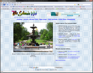
By October 2004, the site’s design had become frustrating enough that a major redesign became necessary. By that point, the Journal had grown to the point that it no longer made sense to split it across Life and Times and Archives, with its needing to be a separate section in its own right. With the fifteen most recent posts’ sitting in Life and Times, and the rest of it in Archives, despite the Journal’s formally being a part of Life and Times, most of its content lived in Archives. Additionally, I had finally gotten fed up with the scroll-box navigation, and was looking forward to getting rid of it. When I redesigned in 2004, I went for a back-to-basics approach, which ultimately produced a site design that had more in common with the 2001 “Circles” design than with the two most recent generations of design.
By late 2004, I felt like I could design for higher resolutions, and as such, I now built for 1024×768. That meant that I had more horizontal space to work with, and reintroduced the sidebar for navigation, though it was now on the left. I also reworked the header, with a more streamlined and elegant look. The color scheme went to all-blue, with a fade from a darker blue in the header. As far as site sections went, in addition to the Journal’s becoming its own section, the Web Cam section was dropped completely, as I had mostly stopped appearing on it in the summer of 2003. College Life was also dropped as a site section at this time, with the content’s being repackaged as a separate website, where it remains today.
The Faded Blue design was launched over a period of two weeks, where it was very obvious that the site was undergoing changes, with two different designs’ showing at once. I did it in phases in order to get the new Journal feature out as its own thing immediately, while I was still redesigning other sections. As I completed each section for the new design, I launched it, and this continued until all sections were redesigned, with Web Cam’s quietly being eliminated at the end, and College Life’s being spun out about halfway through the process. Everything was completed on November 1.
Following this redesign, changes began to be introduced incrementally, rather than in annual redesigns. The quote article was retired in early 2005, which led to a main page redesign that introduced the Photo Feature for the first time, displaying vertical photos. The main page was further modified in 2006 in order to display both horizontal and vertical photos. Thus by the time the “Faded Blue” era ended in 2008, the site was a very different beast than it was in late 2004.
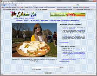
This design began the tradition of changing the tagline on the header underneath the logo to an anniversary message after the site completes a multiple-of-five anniversary. The first time was for the tenth anniversary, with “Celebrating ten years online”.
In 2007, while this design was active, the site was ported from a Windows host to a Linux host. Due to the extensive use of ASP, the entire site had to be rebuilt, as the existing site would be unable to operate on a Linux server. As far as appearances went, the new build of the site looked exactly like the old, with only minor tweaks, and rewrites of some older pages. However, the 2007 build was also quite kludgy due to my prioritizing speed over cleanliness of code, as the site had been completely down for several days prior to its coming back online with the new build. The site was relaunched with this new build in stages, as site sections were brought back online one at a time as they were converted.
June 2008 – September 2012
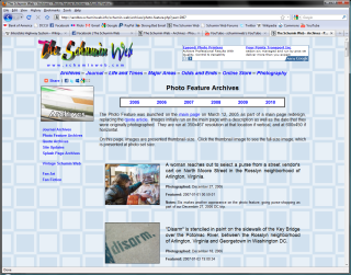
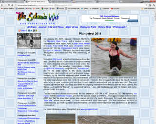
“Blue Squares” design
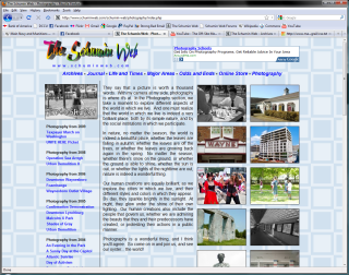
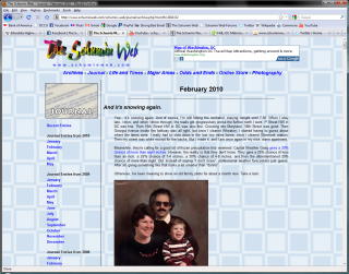
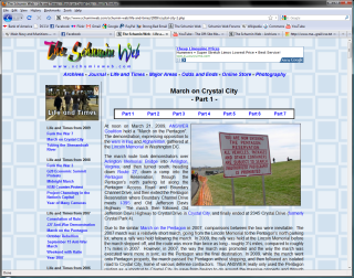
In 2008, I refreshed the site’s appearance while maintaining the basic layout. To this end, I changed the background of the site from the fade to a blue “squares in squares” pattern, and tweaked a number of features throughout to better integrate this new look with the site’s identity.
In 2010, the site was once again rebuilt to the same specifications as then existed, with only minor tweaks on the basic design. The impetus behind making the 2010 build was to make a long-overdue change from a layout driven by HTML tables to CSS style sheets, as well as a slight widening of the content panel. This would make future redesigns much easier, only requiring the modification of the stylesheet to make big changes, rather than having many design elements baked directly into the pages. Additionally, as there was no downtime involved with creating this new site build, the code was perhaps the cleanest that I had done to date, with no kludges or other cut corners in the coding.
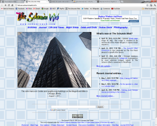
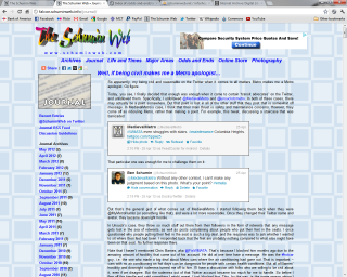
With my mastering of CSS that came over the course of creating the 2010 design, it helped set the stage for Schumin Web‘s most ambitious reworking of the site to date, a project codenamed “Falcon”. This effort converted the site from static HTML and several small databases to something that ran on the WordPress content management platform. During a development period that would last about a year and touch every corner of the site, I took advantage of WordPress’s built-in features to streamline a number of areas of the site and generally smooth a lot of things out. In addition, every image that could be restored from the original masters was restored, with higher resolution images made available in many places where they were previously unavailable. This had an added advantage of bringing older material up to current design specifications.
However, despite all of the enhancements, the site under WordPress was once again built to the same specifications as the 2010 site, with many elements from the 2010 design’s style sheet’s being carried directly over to the new WordPress site. While my original plan was to do a full redesign of the site’s appearance along with the WordPress conversion, my coming up with a new design proved to be a stumbling block, and I decided that it was a better idea to treat the conversion and the redesign as separate projects, and build to the existing design specifications once again, and change thei site’s visual appearance later on. WordPress theme development, which made WordPress look like Schumin Web, occurred from June 2011 to August 2011. Content porting began in August 2011 and lasted through May 2012, with work on new material, cleanup, and beta testing occurred in May and June 2012. The Schumin Web under WordPress launched on July 1, 2012.
September 2012 – August 2013
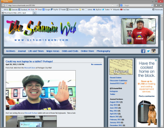
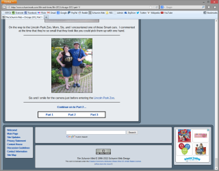
“Modern Blue” design
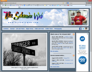
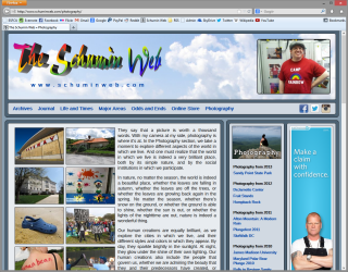
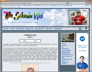
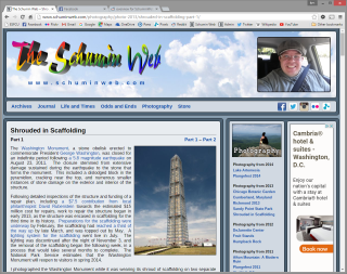
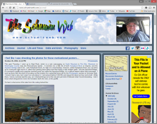
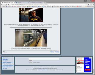
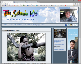
With Modern Blue, introduced September 30, 2012, Schumin Web finally broke free of the design that it had carried for nearly eight years, introduced in October 2004 with Faded Blue and continued with Blue Squares. With Modern Blue, the site took on a modular appearance, as the header, content panel, sidebars, and footer were all in separate boxes, with visual space between each element. The splash photo moved from the Welcome page (where it had been relocated following the elimination of the splash page during the WordPress conversion) to the top of every page as part of a new full-width masthead. This marked the first time that my photo would be on the Main Page on a regular basis since the Circles design of 2001-2002. The Journal was redesigned for the first time with Modern Blue, making better use of space and making features introduced in the WordPress conversion appear natural (as compared to their being retrofitted onto an older design). The site also got a specific print stylesheet for the first time with Modern Blue, providing a version of the site optimized for hardcopy and PDF distribution.
Certain legacy design elements were retained in Modern Blue. While Journal entries got a new, modern header, most other pages retained the earlier header style consisting of centered text, and multipart photo sets retained the white navigation boxes that were used previously.
August 2013 – Present
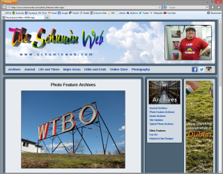
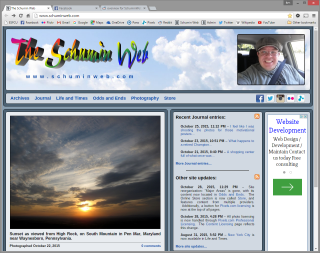
“Modern Blue 2.0” design
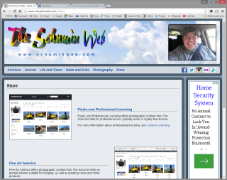
Modern Blue 2.0 was a significant refinement of the earlier Modern Blue concept. The most visible change was the restyling of legacy design elements to match the Modern Blue design language that was first introduced in the Journal, providing a unified appearance for all header elements. Additionally, in October 2015, sections were changed for the first time since late 2004, eliminating the “Major Areas” section, and renaming the “Online Store” section to “Store” and changing it into a launch page for several e-commerce sites.
