Blue. Blue is good.
2 minute read
October 16, 2004, 11:45 AM
Well, so far in my going about fishing for opinions for my test area for the site redesign (a bit incomplete), it’s been positive so far, and a change has been made to the header based on feedback. I love getting feedback.
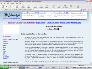
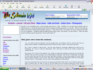
What’s interesting, though, is the difference the little things make. Compare:
The left image is the “before”, with the ad banner at the top in leaderboard style. My logo was a bit crowded around the top. The logo on the left image is the same size as on the existing site (blue-cream fade). On the right image, we fixed it. The banner is back to its old, smaller size, and my logo is a bit bigger. Much more prominent.
I describe it like a bit of a reality check. The first one looks like I’ve sold out to corporate interests with the leaderboard overpowering my own logo. Then the other one is where the reality fairy comes by and waves its magic wand and normalizes everything with a touch of “get real”. And I like look #2. But we’ll see what else changes before it’s all said and done.
Meanwhile, I’m finally doing away with the scroll-box navigation for a more traditional side menu. Though it will be a little racier than before. Now it’s left-aligned! It’s a little different than before, and it ought to be fun. And somehow, I’m going to drive it all from a database again.
And then that white box will be a smaller version of the header banners that tell you what section you’re in. And notice that “College Life” and “Web Cam” are missing, as one is now a full-blown subsidiary site, and the other was discontinued.
I’m also keeping meticulous notes on everything, so that if somehow in the course of designing it, I manage to damage my prototype beyond repair (we don’t have the premade templates at this stage), I have all the specifications written down somewhere to redo it all.
So anyway, I’m fishing for compliments, as the saying goes, but also fishing for constructive criticism, since this is a test area, and while some stuff is incomplete, it’s complete enough to get a realistic idea of what is going on.
Song: "Mega Mouse" from Today's Special
Quote: By the way, if you're looking at this in the Archives way off in the future (or at least a couple of months down the road) and thinking, what the heck if the test section and the rest of the site look the same, don't worry. The testing was done in an actual site section.
Categories: Schumin Web meta


Leave a Reply