What “SPECIAL” really means…
8 minute read
October 3, 2012, 12:14 AM
This morning as I was taking the Red Line to work and reading the Express, I read the DC Rider section, as I usually do. Today, they ran a rider Q&A with Dr. Gridlock. One of the questions that was posed was about Metro’s destination signage, which I quote here along with Dr. Gridlock’s answer:
Q: Why doesn’t Metro label trains during their weekend shutdowns? Several times this weekend on the Green Line, I saw passengers confused by trains that were only labeled “Special” with no color line identified on the front. One lady rushed off a train at L’Enfant Plaza because she thought it was a Yellow Line train, and another guy was about to try to transfer because he didn’t know the train was going to Congress Heights.
Dr. Gridlock: I don’t see any good coming from labeling trains “Special.” When Rush Plus began, Metro officials made such a big deal out of telling everyone to watch the destination signs.
I have a few concerns with this response. First off, the response mixes up regular service with temporary service changes for track work. Metro’s Rush+ is the regular service pattern during the hours that it is in operation, and comes with certain things like programming in destination sign information for the regular terminals if need be, maps, and permanent signage. Service changes for track work are only in effect for a weekend, and thus what Metro has at its disposal is different, and it’s not always feasible to make things look like they do in regular service for weekend service changes. Second, they leave PIDS completely out of the equation in the response. And last, there seems to be a lack of understanding on both parties’ part about what makes Metro pull out that “SPECIAL” destination sign in the first place.
Categories: DC area local news, WMATA
The highlights of the visit to Natural Bridge…
6 minute read
September 28, 2012, 10:39 PM
So on this, the night before I pull the wraps off of the new “Modern Blue” design and hang up the “Blue Squares” design for good, I realized that I never showed you the pictures that I took in Natural Bridge last week. While I was down visiting the family, we all went down to Natural Bridge on the 20th and saw this geological formation. We realized that in twenty years in the area, we had never seen the Natural Bridge from which Rockbridge County takes its name (and by the way, the town and the rock formation are both properly named “Natural Bridge” – confused yet?). Mom, Sis, and I saw the wax museum there in 1993, but never the bridge itself. So we did. And here are the highlights:
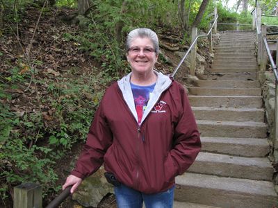
Mom stops for a smile on the stairs down to the Natural Bridge.
And this is what Shenandoah Acres looks like now…
3 minute read
September 21, 2012, 9:01 PM
So while I was out and about today, I got new photos of Shenandoah Acres as a follow-up to my previous Journal entry on Shenandoah Acres. And if you ask me, it was kind of depressing. Take a look:
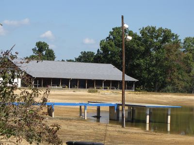
One of two platforms in the lake, and the 1997 beach house. To give you an idea of the normal lake level, the platform was less than a foot above the water level, and the platform was completely surrounded by water.
Categories: Shenandoah Acres, Stuarts Draft
A train ride with far more excitement than you might expect…
4 minute read
September 19, 2012, 9:21 PM
This is also why, when I’m traveling on a public mode of transportation, the idea is to leave early so that I can be at the boarding location in plenty of time, just in case anything goes wrong in the process. Today was one of those days where something went wrong. I described it as a “clusterf—“, and I think that was putting it nicely.
First of all, though, to set things up: I’m in Stuarts Draft right now, and I went there on Amtrak’s westbound Cardinal. To get there, my plan was to take the 51 from my house to Glenmont, and then take the Red Line to Union Station. Initially, things went well. I caught the same 51 that I usually get to go to work, and caught my Red Line train.
And then things went downhill from there.
The Red Line was having a power problem on Track 2 at Brentwood Yard. Thus they had to single track through the yard, during morning rush hour. Whenever you hear “single tracking” and “rush hour” in the same sentence, by the way, that’s never a good sign. So at Glenmont, we sat for several minutes before we started the run – much longer than usual. Then we proceeded to Wheaton and held again. No hold at Forest Glen. Then we held for about ten minutes each at Silver Spring and Takoma.
And then things got worse. There was a second power problem on the Red Line at Van Ness-UDC, with single tracking over there, too. Lovely. By this point, Metro was telling people in the e-alerts to consider taking the Green Line. That’s when you know it’s bad. With two areas of single tracking, I bailed at Fort Totten and took the Green Line.
“I’ve gotta get up and move around!”
3 minute read
September 17, 2012, 10:42 PM
I think this describes this past Saturday quite well:
Categories: Music, Recreation/Exercise
Discovery looked like it had made many trips into space…
5 minute read
September 12, 2012, 12:00 AM
So this past Sunday, I was involved in a day out with family. It was a lot of fun, and I don’t get to see any of them nearly as much as I would like. Uncle Bruce and Aunt Mary came down from New Jersey, and Dad (Mom couldn’t make this one) came up from Stuarts Draft, and we spent the afternoon at the Smithsonian’s Udvar-Hazy Center seeing the Space Shuttle Discovery, among other things there. Of the four of us, I was the only one who had been there before. So I sort of knew what was where in there, though I admit that on my last trip there with Mom, we spent like 95% of our time there in the space wing.
Personally, the thing I was most excited about seeing was Discovery, since the last time I was there, Enterprise was the shuttle on display. It was interesting to see the difference in how a test article looked vs. the real thing. And as you might expect, Discovery looked like it had made no less than 39 trips into space over the course of nearly three decades, and had been put through its paces. Enterprise, on the other hand, was perfect black and white. So most of my photos focused on Discovery:
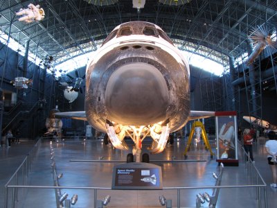
The nose of Discovery. Compare to a similar view of Enterprise.
And so this is (roughly) what the redesign will look like…
2 minute read
September 10, 2012, 12:36 AM
So this is what it’s going to look like:
This shouldn’t really surprise anyone. The various reviews of this design were favorable, and so I’m going to move it towards production. “Moving it towards production” in this case means, now that I’m settled on the design, building it for real with the cleanest code that I can possibly write. After all, when I’m designing and testing, I’m not necessarily being the neatest that I can be. I’ll comment code out, make code obsolete, or otherwise leave “debris” around. The production version, however, will have only what it’s supposed to have, and no more (and no less).
Categories: Schumin Web meta
Now let’s talk about the Journal…
3 minute read
September 3, 2012, 5:16 PM
You may have noticed that, except for the “Magic” concept, I never showed you pictures of the Journal. If you go back and look at the Journal entries where I introduced the last three concept designs (first, second, and third), I show the Main Page, I show photo sets, I show intro pages, and whatever other pages, but never the Journal. That’s because I hadn’t quite nailed down how I wanted to do the Journal.
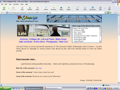
Going into this, realize that the Journal has never seen a major redesign since it was introduced nine years ago, in July 2003. Here’s a screenshot of the Journal from then, while the Journal was still in its original place on the front of Life and Times, just before it launched:
Categories: Schumin Web meta
What to do with Shenandoah Acres?
8 minute read
September 2, 2012, 8:39 PM
For the last few years, I have been involved in a Facebook group called “Remembering Shenandoah Acres“. This group is built around discussing memories of times spent at the Shenandoah Acres resort in Stuarts Draft that closed after the 2004 season, but most discussions anymore center around complaining about the state that the property is now in.
For those not familiar, Shenandoah Acres was a facility that billed itself as “America’s Finest Inland Beach”, owned and operated by the Blacka family for many years. It had a campground, there were cabins, and a motel building on the property. The facility also had tennis courts, trail rides on horseback, and miniature golf. However, the centerpiece of the facility was a manmade lake with a beach around it, playground equipment in the water (including one slide about two or three stories high), and a large tower in the center that offered a zip line ride. The facility was a popular tourist attraction, and the lake was also very popular with locals during the summer season.
In the years that I’ve been familiar with the facility, one of the merry go rounds in the water was replaced in 1995 by “Clyde the Slyde”, which was a small slide built inside a dinosaur sculpture, and the zip lines were dismantled in the late 1990s or early 2000s and replaced with the “Pink Zipper” water slide. Additionally, the roof of the original beach house collapsed due to excessive snowfall in 1997, and was replaced with a new structure slightly to the northeast of the original. The facility closed after the 2004 season because, according to the owner at the time, whom my family went to church with, the cost of insurance finally became too much to bear. My family went to Shenandoah Acres from 1993 until about 1996.
Categories: Shenandoah Acres, Stuarts Draft
Trying out a third concept. Your opinions appreciated.
5 minute read
August 26, 2012, 12:36 PM
So I’m now on my third design concept. This one, as I kind of indicated before, I decided to finally design for a larger resolution, after about eight years of designing for 1024 pixels across. Now I’m designing for 1280 pixels across, and then I will use CSS to scale this down for smaller widths once I get the main design going. So here are some sample screenshots:
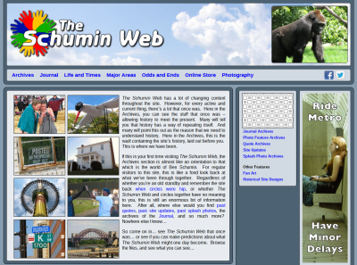
Archives main page.
Categories: Schumin Web meta
New fire alarms at work… again…
7 minute read
August 24, 2012, 10:17 PM
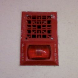
So apparently the folks who run the building where I work are looking to improve the fire alarm system. Recall that in 2009, the fire alarm notification appliances were replaced after an incident where someone pulled a fire alarm in our building due to smoke from a car fire in an alley behind the building, and those of us looking out the window at the fire couldn’t hear the alarm going off. For that, we started with Wheelock 34 horns and Space Age AV32 light plates:
Categories: Fire alarms, Work
So tonight, I had an “aha” moment…
3 minute read
August 21, 2012, 11:39 PM
So I had an “aha” moment tonight while trying to figure out how to shoehorn an above-the-fold ad into the otherwise nice looking design concept that I showed you a week or so ago. I was looking at this page and noticed how it had advertisements to the side, and made good use of all of the space regardless of screen size. I resized my browser window to make it really narrow, and the site rearranged itself to work in the smaller space that it was now in without horizontal scroll bars. I studied its CSS and then did a little research on what I found.
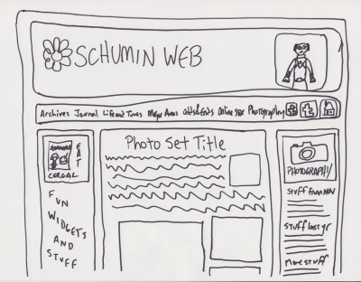
And then I had my “aha” moment. I can use CSS to design for different resolutions. I can design for a wider resolution than I’ve been designing for, and use CSS to optimize it for netbooks. As of late, the ultimate arbiter on width for Schumin Web has been my netbook, with its 1024 pixel width. If I got horizontal scroll bars for my design, then I was designing too wide. Complicating things is that my site uses a content panel that’s around 750 pixels wide and makes good use of all that width, especially in Photography. Having another 250 pixels to work with is a game changer. So I sat down and doodled, and this is what I came up with:
Categories: Schumin Web meta
It pains me to say this…
3 minute read
August 20, 2012, 8:12 PM
Yes, it pains me to say this. Literally. It only took 25 years of using a computer to do it, but I have managed to give myself a repetitive stress injury from typing. I know – I’m as surprised as you are. And it’s not what you think, either. I figured that eventually, I would do something to my wrists from all of the stuff that I do on the computer despite the precautions that I take, like using a wrist pad. Turns out that my use of the wrist pad, which is a habit that I picked up from my job at the phone company more than a decade ago, has done me a lot of good, because I didn’t injure my wrists.
No – I injured my left thumb. And you know what I did to injure it? This:
Categories: Personal health
Taking the swimming outside for a week…
6 minute read
August 16, 2012, 10:52 PM
So this week and next week are when Olney Indoor Swim Center, the place where I normally swim four days a week, is closed for its annual maintenance. During that time, as I understand it, they drain the pool and acid clean the pool sides, do maintenance on whatever systems, change any lights that need replacement, deep clean the entire building, and then fill the pools back up. I’m told it takes four days to properly drain the main pool so as not to overload the wastewater system by letting too much water come through at once.
In the meantime, I am continuing to swim. This year, I know what I’m doing in the pool, and so the annual maintenance period does not coincide with a nasty case of swimmer’s ear. Last year, you see, the where-to-swim problem resolved itself with the whole ear infection thing, since that kept me out of the pool entirely for that time. This year, I decided I wanted to try an outdoor pool. I’ve been to the other county indoor pools, and each of them had various qualities that made me pick an outdoor pool over them. MLK Swim Center is really old and closes kind of early. Montgomery Aquatic Center (pardon – “Kennedy Shriver Aquatic Center”) is of reasonable distance away, but the staff there really gets on my nerves because they’re so uptight about everything and act like they’re doing me a favor for stuff that the staff at the other pools would do without all the whining. That and aside from late night laps (i.e. 9-10 PM) on Mondays and Wednesdays, the pool is so booked up with other programs that there is no room for evening lap swimming anyway. Now Germantown Indoor Swim Center is a gorgeous facility, which I’ve been to once before. I love Germantown indoor pool, but Germantown is just too far away, being in the northern part of Montgomery County and all of that. It’s a bit of a hike from my house, and if I left right from work, that would be double the distance and in rush hour traffic to boot.
So with that all said, I decided to give an outdoor pool a spin while Olney was closed.
Categories: Swimming
SlutWalk DC was pretty fun, but a bit tamer than last year…
5 minute read
August 16, 2012, 12:06 AM
So this past Saturday, I participated in SlutWalk DC 2012. You may recall that I covered SlutWalk DC in 2011. SlutWalk’s goal is to demonstrate that it doesn’t matter what a person is wearing (or not wearing). Sexual activity requires the consent of all involved, and sexual activity without the consent of all involved is rape. So in short: consent is key. Consensual sex is sexy, but nonconsensual sex is rape. And clothes are inanimate objects. They cannot give consent for their wearer.
However, I was a little bit disappointed with the turnout on this one. I thought that last year’s event was fairly well attended for a DC event with a local focus. After all, SlutWalk in DC isn’t a national event. Cities have their own local SlutWalk. This wasn’t a bus-em-in event with a national scope like September 24, 2005 or January 27, 2007. But this year, the crowd felt a bit smaller, both in Lafayette Park and at the Sylvan Theatre. I also thought that the signs were less exciting and less creative than last year’s, and that things were generally a bit tamer overall than before. I also noticed that the gender balance was a bit more skewed towards the female side than last year. I expected a majority of the attendees to be female, but I felt like there were very few guys there this time.
On that last note, I think it’s very important for men to go to events like this because helps balance the message. It helps send the message that rape and consent is a serious matter and important for everyone, and not just for women. Men can also be the victims of nonconsensual sexual acts, and so the issue of consent is by no means something that only affects women. Additionally, by having a good amount of men there, it also helps to prevent the event from being perceived by some, justified or not, as male bashing. I didn’t get that perception during the event itself last year, but interestingly enough, I got that feeling when I was putting the photo set together at home several months after the event. And I figured that if I got that vibe while working on the photo set, it would be reasonable to think that others might pick that unintended message up as well. Thus in putting the photo set together, I deliberately tried to counter the perception that I was getting by including more photos that focused on sex-positivity or that had a more lighthearted message. I definitely included some serious photos (particularly this one), but I tried to keep it balanced for the most part. I think I was pretty successful in keeping the photo set’s mood light, but ultimately, you – the reader – will be the one to make the call about whether or not I was actually successful in this.
Categories: Activism





 Continue reading…
