If you can’t follow a license as easy as mine…
7 minute read
October 9, 2013, 3:21 PM
I am of the view that information deserves to be free, which is one of the reasons that I make my work available under a Creative Commons license. For those not familiar, I provide my content under the Creative Commons Attribution-ShareAlike 3.0 United States license. In a nutshell, that means that you are welcome to use materials found here for any purpose, including commercially, as long as you provide proper attribution, and share it under the same or similar license as you found it (it’s only fair, after all). I even wrote a guide on reuse of content found here. When I converted the site to WordPress, one of the changes that I made was to make the images available for download at full resolution. That was done specifically to help downstream users get what they need and get creating without assistance from me. That same conversion, with the image restoraton and such that went along with it, also finally allowed me to provide clean images right out of the box. Recall that at one point, I put my logo and URL in the corner of the large-size images for photo sets. Then I stopped doing that in 2005 or so, right around when I introduced the Creative Commons license to the site. The conversion and image restoration work removed all of the remaining tagged images, making every photo “clean” without any extraneous markings.
I like to think that I’m one of the more permissive and lenient content owners out there. Unlike many other entities that do not allow downstream use without explicit permission, I do allow downstream use right out of the box, as long as two things are present: attribution (preferably as “Ben Schumin/The Schumin Web”), and a free license. That’s not that hard to do, and by and large, most people who reuse content found here follow the license. But it really frosts my cookies when people don’t follow that, and because my license is so easy to meet, I take a very dim view toward noncompliance.
It always amazes me how many people think that because something is on the public Internet, that it’s public domain and can be used with wild abandon. It’s quite common. I’ve even had to disabuse my own mother of this notion before. Rather, just like any other medium, just because it exists does not mean that you have carte blanche to do whatever you want with it. Most material on the Internet is not, in fact, public domain, and therefore potential downstream users have to play by the content owner’s rules (or you don’t play). Those rules are up to the content owner.
Categories: Copyright infringement, Netculture, Schumin Web meta
Two near-identical photo features…
5 minute read
September 2, 2013, 11:54 PM
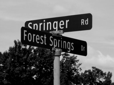
As of this writing, the photo feature shows a street sign marking the intersection of Forest Springs Drive and Springer Road in Stuarts Draft, taken on August 25:
Categories: Roads, Schumin Web meta, Stuarts Draft
A very upbeat goodbye…
7 minute read
July 22, 2013, 11:28 PM
You may have gotten a hint from the notes in the July 14 photo feature, but this past Friday, July 19, was my last day working at Food & Water Watch.
On my last day, we were having an ice cream social in my honor. I wanted to make it a celebration of me rather than an emotional goodbye, so I made a slideshow of photos to go through and talk about with the folks gathered. Many had never seen these photos before, and I was sure that the photos would garner some laughs and rekindle fond memories.
On the evening before my last day, though, I was a bit nervous. I was somewhat uptight about how my emotional state would be when I finally said goodbye. I didn’t want to cry on my last day, but I was really afraid that I might. I even went to far as to post this Facebook status at 1:44 in the morning:
Thinking about my last day at Food & Water Watch on Friday. Wondering how the mood will be when I finally say goodbye, and thinking about it in terms of the ending theme for an episode of Today’s Special. I think it could go one of three ways:
1) A very upbeat end to the day. That would warrant the regular ending theme.
2) A more emotional ending that might have me in tears at the end of it. That kind of end would call for the flute theme that was used in “Butterflies”, “Babies”, “Wishes”, and “Phil’s Visit”.
3) Considering that I have a slideshow with old photos planned, it might be a celebration of days past with mixed emotions of laughter and sadness. For that, I would lean towards the ending theme used in “Memories”, the series’ last episode, which was a continuation of that episode’s final song.
We’ll see how it plays out on Friday, but I’m rooting for the day to warrant the regular ending theme.
Categories: Friends, Schumin Web meta, Washington DC, Work
Big anniversaries this weekend…
4 minute read
June 29, 2013, 4:36 PM
So this weekend marks a couple of big anniversaries. First, tonight marks the anniversary of the big derecho that came through the DC area. That was a rather interesting time. I remember that Montgomery County looked like something had hit it, with power out and tree branches down all over the place. Lots of traffic lights were out as well, which snarled all of the traffic as people had to actually be courteous on the highway.
But as far as I was concerned, that derecho couldn’t have come at a worse time. See, the next night was the night that I had announced a major upgrade to Schumin Web. That was the night that the final cutover to WordPress would occur. That work was the completion of a project that I had codenamed “Falcon” (after a JMU student web server) that converted the entirety of the site to run on the WordPress platform. Prior to that, the site was a mishmash of different systems put together to make one website. Some of the site was static HTML. Some of it ran on a MySQL database. Some of it ran on a different MySQL database. Some of it ran on yet another different MySQL database. And there were some dependencies between the main site and my other sites (in “Major Areas“), where material was shared between them, including one shared database between College Life and the main site (historical note: College Life was part of the main site until October 2004 – thus the shared database). Thus with the final conversion, that changed some things. First, it rolled out a single, unified system for the main site, as I could now edit the entire site from a single place. And second, it broke all of those dependencies with the old site. On that latter point, I had to do quite a bit of prep work, since the goal was to cleanly “divorce” the main site from the others, while not breaking anything on either side.
Not breaking things was key there. And I was more worried about the side that wasn’t the main site. I wasn’t worried about Schumin Web proper. Everything was being reworked and moved around over there, and so things were not going to be broken because everything was being placed new again, and checked over multiple times. But the other sites were being left as they were, and needed to be fixed. Whether they would be converted to WordPress or another CMS would be a different discussion based on each site’s needs. But I had to make sure that the shared databases were separated. I had to make sure that any images were brought in-house for the specific site (i.e. no more cross-hosting). I basically had to make sure that each site was completely independent of the other, which I should have done from the get-go, but for whatever reason, didn’t do back then. But I managed to get it all working.
Categories: Schumin Web meta, Weather
So I’m at work modernizing websites again…
6 minute read
December 11, 2012, 1:07 AM
So I’m at it again, working to modernize a Schumin Web property. You may recall (and it’s pretty hard to miss) that Schumin Web proper was converted to WordPress over the course of a year in 2011-2012. Then College Life was converted to WordPress last month in a process that took about a week and a half to do. That leaves the Today’s Special site and Transit Center left to be upgraded.
The current project is to convert the Today’s Special site to a content platform of some sort. However, unlike Schumin Web proper and College Life, this one isn’t going to be where the site is ported to a content platform but looks the same to the user in the end as it did before. This is going to be a big project for different reasons. I am finally going to take the Today’s Special site and bring it into the 21st century. Here’s a little secret for you: I have been unhappy with that site’s design and structure for a little over five years now. The site last received a major redesign/overhaul in 2005 (while I was out of commission due to some minor surgery), and that mainly improved the writing and the layout, while keeping the general structure the same. When I converted the site to PHP with the move to Dreamhost in 2007, I had wanted to do a big overhaul on it, but ultimately ended up converting it more or less the same as it was before, owing to time constraints and also my own capabilities at that time.
Now, my long-dreamed-of overhaul is coming. I have the time, and I now have the technical knowledge and the maturity to bring my vision to reality. The Today’s Special site is going to become a wiki. It’s going to move away from fansite and more towards being a knowledge base – the source for all things Today’s Special. Using Homestar Runner Wiki and Muppet Wiki as inspiration, my plan is to greatly expand the depth and breadth of coverage of the Today’s Special site, and be as extensive as I can get it. And with the wiki format, this can and should be a collaborative effort. I want other fans to join in. I hope that Today’s Special alumni will contribute. I hope that TVOntario joins in, too. I think everyone with an interest in the show has something to contribute, even if it’s just correcting a typo, or removing a stray comma.
Categories: Schumin Web meta, Today's Special, Wikipedia
One of my photos goes viral… sort of.
5 minute read
October 24, 2012, 11:12 PM
So apparently one of my photos has gone viral. Remember this photo?
I took this photo on July 4, 2006 in front of the White House. It first appeared on Schumin Web in a Journal entry posted July 5, 2006 about a trip I made to DC on July 4. It also ran as the Photo Feature later in the same month.
Categories: Anti-war, Copyright infringement, National politics, Schumin Web meta
And so this is (roughly) what the redesign will look like…
2 minute read
September 10, 2012, 12:36 AM
So this is what it’s going to look like:
This shouldn’t really surprise anyone. The various reviews of this design were favorable, and so I’m going to move it towards production. “Moving it towards production” in this case means, now that I’m settled on the design, building it for real with the cleanest code that I can possibly write. After all, when I’m designing and testing, I’m not necessarily being the neatest that I can be. I’ll comment code out, make code obsolete, or otherwise leave “debris” around. The production version, however, will have only what it’s supposed to have, and no more (and no less).
Categories: Schumin Web meta
Now let’s talk about the Journal…
3 minute read
September 3, 2012, 5:16 PM
You may have noticed that, except for the “Magic” concept, I never showed you pictures of the Journal. If you go back and look at the Journal entries where I introduced the last three concept designs (first, second, and third), I show the Main Page, I show photo sets, I show intro pages, and whatever other pages, but never the Journal. That’s because I hadn’t quite nailed down how I wanted to do the Journal.
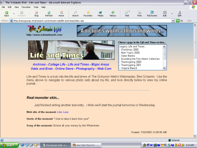
Going into this, realize that the Journal has never seen a major redesign since it was introduced nine years ago, in July 2003. Here’s a screenshot of the Journal from then, while the Journal was still in its original place on the front of Life and Times, just before it launched:
Categories: Schumin Web meta
Trying out a third concept. Your opinions appreciated.
5 minute read
August 26, 2012, 12:36 PM
So I’m now on my third design concept. This one, as I kind of indicated before, I decided to finally design for a larger resolution, after about eight years of designing for 1024 pixels across. Now I’m designing for 1280 pixels across, and then I will use CSS to scale this down for smaller widths once I get the main design going. So here are some sample screenshots:
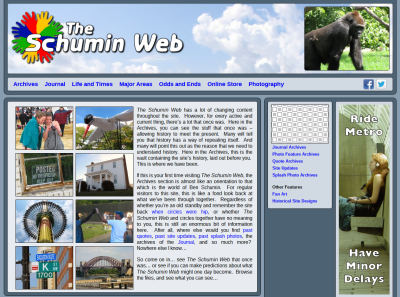
Archives main page.
Categories: Schumin Web meta
So tonight, I had an “aha” moment…
3 minute read
August 21, 2012, 11:39 PM
So I had an “aha” moment tonight while trying to figure out how to shoehorn an above-the-fold ad into the otherwise nice looking design concept that I showed you a week or so ago. I was looking at this page and noticed how it had advertisements to the side, and made good use of all of the space regardless of screen size. I resized my browser window to make it really narrow, and the site rearranged itself to work in the smaller space that it was now in without horizontal scroll bars. I studied its CSS and then did a little research on what I found.
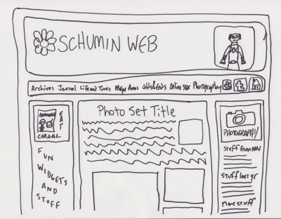
And then I had my “aha” moment. I can use CSS to design for different resolutions. I can design for a wider resolution than I’ve been designing for, and use CSS to optimize it for netbooks. As of late, the ultimate arbiter on width for Schumin Web has been my netbook, with its 1024 pixel width. If I got horizontal scroll bars for my design, then I was designing too wide. Complicating things is that my site uses a content panel that’s around 750 pixels wide and makes good use of all that width, especially in Photography. Having another 250 pixels to work with is a game changer. So I sat down and doodled, and this is what I came up with:
Categories: Schumin Web meta
Another concept, another request for feedback…
4 minute read
August 12, 2012, 11:49 PM
So I took the concept design that I showed you about a week ago back to the drawing board and made some changes. This is actually both a step forward and a step back in the progression of things. While this design builds on the earlier design, it actually throws out the theme work I did in the last design. The earlier design was a completely new theme, while this one I’m about to show you directly modifies the current production theme. The reason for throwing out the newer theme was because I had so many problems with it. That made throwing it out worthwhile. Dirty little secret: some of the details in the other theme were fudged with a graphics program, since I couldn’t get the CSS to work out the way I wanted.
So here are the screenshots:
Categories: Schumin Web meta
Okay, folks, feedback time!
2 minute read
August 4, 2012, 9:30 PM
So I spent some time today playing around with a new theme for the site. Something on the way towards the ultimate goal: a new look for The Schumin Web after nearly eight years with more or less the same design.
In making this new design, I put what I had been throwing around for a while in my head into Dreamweaver to see what it would look like. And this is what I came up with:
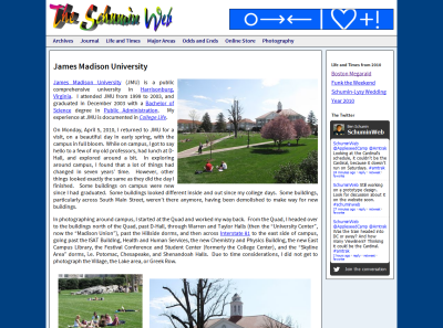
“James Madison University” Photography set
Categories: Schumin Web meta
“Magic” is the latest concept…
2 minute read
July 24, 2012, 10:31 PM
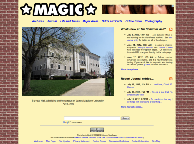
So I’m testing concepts in my sandbox site ahead of a full redesign. I want to see what I think of potential color schemes and potential new arrangements, and what others think about the same. So I put something together last night to see what it would look like. What I did was I went with a dark background color and put a light background behind the content. I also replaced the logo, mainly just to get my regular logo out of the picture (since I want to change it anyway). Nothing else changed. The layout is exactly the same. Just colors and the logo.
And here is the result:
Categories: Schumin Web meta
The post-launch tweaks…
4 minute read
July 5, 2012, 9:15 PM
So the launch of The Schumin Web under WordPress is now five days in the past. And now that it’s all in production, that’s when things start to come out. Since the launch on Sunday, I have fixed a few errors in the Stuarts Draft High School photo set, I have changed the way I present RSS feeds on the site, I’ve connected all the various feeds to Facebook, and the comment system is a little different than when it launched.
On that last point, I am also slowly but surely getting used to the concept of comments and how to handle them. For one thing, since comments are moderated, I get notified on my phone when comments come through so that I can review and approve them wherever I happen to be. So now I have two notification tones. I have this tone for regular text messages and such, which I’ve had on three different phones since 2008. Now I also have this sound for comments through the Disqus app. And I’ll bet that a lot of people are not surprised at all that I would have that for the comments tone (if you haven’t listened to it yet, I’ll wait). Considering what it is, though, it certainly has great comedic potential around friends. First time it went off was for some test comments that I threw at the site to see what would happen. But then the first time that it went off “for real” while I was out and about was on Monday night. I was leaving the pool and walking towards the car, and it went off. Felt like real Power Ranger right there. It was a comment, but with that kind of sound, it could have been a monster attacking Angel Grove (or at least a few putties). You never know with these things. But I’m slowly but surely getting used to it.
A few folks have questioned why I’m locking down my comments to the extent that I am. Realize that right now, registration is required through one of a choice of six different services (Facebook, the Twitter, etc.), and all comments require approval before they’re visible. As I see it, since the comment system is brand new right now, I’m taking a very cautious approach to things starting out. Realize that, outside of my old discussion forums, the last time I allowed people to post on Schumin Web was about nine years ago. I used to have a guest book on my site, and it eventually became more of a hassle than it was worth. I spent far too much time removing rude and uncivil comments from my guest book that people posted there. So on April 16, 2003, I locked the guest books down, and then removed them. I do not regret that decision. The memory of that incident four months before the Journal launched, along with my inability to program such a thing on the old site, led me to not include comments on the Journal when I started that in August 2003. Now, though, the Internet has changed, and I think I can allow commenting directly on the site once again. Why let a group of morons derail good “Web 2.0” discussion, right? The discussion guidelines lay out the ground rules, and anything that falls below the guidelines won’t be allowed through. Additionally, I am not allowing anonymous comments in an attempt to bring some civility and prevent the abuses that happened with the old guestbooks, since the names and emails on the abusive posts were fake, and just as mean-spirited as the comments themselves. So the idea there is that people have to associate their comments with an already established identity on a third party’s site. Thus you have to throw a reputation of some sort behind your posts. I’m not worried so much about whether it’s a person’s real name or not, because regardless of whether you’re posting as “John Smith” or “Unsuck DC Metro”, you’re not using my site to establish a brand for yourself.
Categories: Schumin Web meta
Welcome to The Schumin Web, now powered by WordPress!
5 minute read
July 1, 2012, 12:01 AM
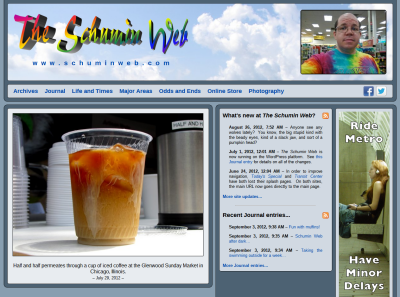
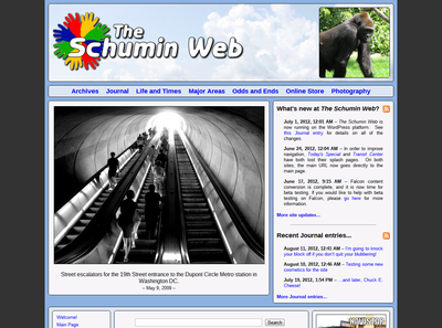
So how does it look? This is The Schumin Web under WordPress in production – the culmination of about a year’s worth of effort in converting content from the old platform (a mishmash of whatever seemed to work) to the WordPress platform. The work of the project known as “Falcon” is complete, and Falcon is now The Schumin Web.
I would also like to take a moment to thank the folks who beta tested Falcon over these last two weeks to make sure that everything was perfect and ready to go. It’s always good to have a few extra sets of eyes looking at things to make sure that any mistakes are caught, and I appreciate your helping me check things over.
As far as changes go, there is a lot that’s different in this new build of the site – far more than I can say in a one-sentence site update message. Here’s a rundown of some of the changes that have come with the conversion to the WordPress platform:
-
No more Splash Page. After more than a decade, the Splash Page is no more. The first page that a user entering through the main URL now sees is the Main Page. The Splash Photo feature is now on the Welcome page.
-
Completely new URL structure. If you are linking to or bookmarking anything on this site other than www.schuminweb.com itself, then your links or bookmarks will no longer work. It will probably take a few days for the search engines to catch up, so contact me if you were linking to something and can’t find it on the new site.
-
Fully restored content. All photos have been restored from the originals. I believe that the photos now look better than they ever did. Additionally, all internal and external links have been updated for the new locations of things.
- Full size images online. I now offer my images online at the largest size that I have available. See for yourself. Click and download (but follow the license).
Categories: Schumin Web meta



 Continue reading…