Is it time for a major overhaul?
2 minute read
October 17, 2010, 11:30 AM
I’ve heard this a few times recently. I was told by a coworker that my site is “kinda Web 1.0”, and at the One Nation rally, one of the Rochester folks said that my site looked “kinda 90s”. Ouch.
So that begs the question: Is it time to give Schumin Web a major overhaul? And by “major overhaul”, I don’t mean just a mere redesign that I could do with a style sheet. I mean big time.
If it gives you any idea about where things stand, this is when the various elements that make up Schumin Web came into being:
- Logo: July 1999
- Navigational structure with sections: September 2000
- Archives section: September 2000
- Journal section: October 2004 (part of Life and Times prior to that)
- Life and Times section: July 2003
- Major Areas: September 2000
- Odds and Ends: September 2000 (current form since July 2003)
- Online Store: September 2000 (current form since January 2010)
- Photography: July 2001
- Splash Page: August 2002 (current form)
- Photo Feature: March 2005
- Current layout: October 2004 (rebuilt to same design twice, in 2007 and 2010)
- Current “squares” background: June 2008
Categories: Schumin Web meta
This time, I am saying something substantive while on camera…
< 1 minute read
August 21, 2010, 11:54 PM
So I gave the “Schumin Web Video Journal” (a name I came up with after I filmed this) a spin once again:
Categories: Companies, Products, Project Chanology, Schumin Web meta, Video Journal
Now we have a baseline to improve upon…
2 minute read
August 17, 2010, 6:05 AM
So I bought a new Web cam last night – a Microsoft LifeCam HD-5001. Seems to work well enough, as I sat and video blogged for a bit. Check it out:
Categories: Computer, Schumin Web meta, Video Journal
Welcome to the new site!
5 minute read
June 25, 2010, 7:46 PM
Welcome to the newly-redesigned Schumin Web! Since February, I’ve been busy at work on the site, reworking the code and generally cleaning the site up, and now it’s finished and launched.
The main thrust of this redesign was to finally get away from using tables for layout, and do the layout entirely in CSS. I also pledged to do everything “right” this time, and not do anything kludgy. If I didn’t know how to make something work the way I wanted, then by golly, I researched it to find out how to make it work as intended.
However, the site still generally looks like the old site, since I admit – I really like the layout, and I saw no reason to make major revisions to that at this time. Why fix what’s not broken, after all? But that doesn’t mean I didn’t take the time to do a lot of smaller changes.
Let me give you a quick rundown on some of the stuff that’s new…
Categories: Schumin Web meta
It was always a little kludgy, but it worked…
3 minute read
May 25, 2010, 9:26 PM
Yeah, I’m almost to the point in my redesign where it’s time to design the Journal section. Right now, before even one line of code has been written for it, it makes me nervous. See, I am worried about how many Journal entries will break. After all, I code Journal entries on the fly, and do whatever comes naturally to me. And full CSS layouts are not something I’m accustomed to. So it makes me a little nervous.
But I’m almost there. I’ve done the redesign in this order: the basic page templates, Major Areas, Archives, Odds and Ends, Photography, and most of Life and Times (still working on that last one). That leaves the Journal and then the unnamed “center section” still to do. It’s okay, though. It’s coming along quite well, and with the photo sets mostly done, that’s one less thing I have to worry about.
However, it’s going to be really weird to have done the Journal correctly for a change. Right now, it’s a bit kludgy in places. I cut a lot of corners on the current design, which dates from 2007, to make it look right regardless of whether it was also done correctly. If you look at my code for the Journal, there are a bunch of little invisible graphics that are there just to get the spacing correct. After all, I kind of did the 2007 redesign under a bit of duress. The site had gone down, and I was determined to convert it from ASP to PHP and get it back up as quickly as possible, and the hell with doing it the right way. According to my update log, the Journal was the first item to be restored. Thus not only was I racing to get it back up and running, but I was also perhaps doing most of the learning on a new HTML editor and a new platform on that section. So a few kludges were inevitable, I suppose.
Categories: Schumin Web meta
So should I buy another Web cam?
2 minute read
May 6, 2010, 11:25 PM
I’ve been tossing around the idea for a while of buying another Web cam. One may recall that from 2000 to 2003, I had a feature on this site where I had a Web cam that transmitted a still picture to the site every two minutes. So Web cams and Schumin Web are definitely not unfamiliar concepts.
However, before you start thinking I’m going to resurrect the old Web cam feature, forget it. I am so over that. That feature is dead, and is staying dead.
Actually, I’m thinking about the possibility of doing some Journal entries in video format. I think it would be fun, and I could convey some things that I can’t do in written form, like tone of voice, and hand movements and such.
Of course, that requires actually having a Web cam of some sort. The Web cams that I had in the days of the old Web cam feature are long gone. I either threw them away, gave them away, or they’re buried somewhere in my parents’ house. However, you slice it, I don’t have them. Besides, those old cameras were a pain to deal with anyway, and modern cameras are far superior to and cheaper than the old ones, which by now would be eight and ten years old. Right now, the only access I have to a Web cam is the iSight camera on my office Mac, and there are a whole host of reasons why I will never “video blog” for Schumin Web from the office.
Categories: Computer, Schumin Web meta
So how would you integrate Twitter into Schumin Web?
3 minute read
March 17, 2010, 9:39 PM
As you may have seen on a recent site update, I have jumped on the Twitter bandwagon. I envision using Twitter as kind of a mini-Journal. In other words, stuff that’s not enough for a full Journal entry, but certainly worth a mention. And with the site redesign going on, now is a good time to do this kind of work, rather than shoehorn it in later.
So far, I’ve come up with a footer link for the page. It takes the existing Facebook page link that’s been at the bottom of every page since October and makes it more prominent and pairs it with the new Twitter link. Thus under the row of links with updates, contact, privacy, etc., there will be a new line that says, “Follow The Schumin Web on Facebook and Twitter”, with “Facebook” and “Twitter” in their own logos. Facebook will still be used the same as it always has, consisting mainly of Journal entries and the like. Then Twitter will be like a mini-Journal. Of course, I first have to get into the habit of actually using the Twitter.
So now the question becomes, how do you integrate Twitter into Schumin Web? Considering I envision Twitter as something of a mini-Journal, I was thinking of putting a box of some sort for the Twitter feed there, possibly in the vicinity of the menu.
Categories: Schumin Web meta, Social media
So the redesign for CSS is coming along well…
3 minute read
March 1, 2010, 1:42 AM
The redesign of this site to implement CSS layouts is coming along well. So far, all the major templates are built, the site navigates, and the Archives and Major Areas sections are complete.
I’m building the new version of the site in a “sandbox“, and I’m going to launch it all at once. This isn’t going to be a launch-in-sections like I did in 2004 and 2007. I’m doing the whole thing at once. I’m also deliberately designing it to make sure that no links change. The site still uses PHP, so it’s not like pages are going to have to get re-spidered anyway for an extension change.
As far as how things are going to look, expect to see a number of tweaks. All the screen-captures in Major Areas are updated, and Major Areas has a new header image. In Archives, the Vintage Schumin Web page has been completely rewritten, and I’ve attempted to clean up navigation on the Site Updates page. Then also look for various minor changes throughout, as I bold this or italicize that.
Right now, I’m most worried about two areas. I’m worried about the Main Page, and the Journal. For the Main Page, the Photo Feature concerns me. Currently, the database supplies the left edge of the main content panel, because it varies depending on whether the Photo Feature is horizontal or vertical. I feel that implementing that variable in CSS will be something of a challenge, but I think I’m up to it. Then in the Journal, I’m not too worried about actually designing it all. I’m more worried that a few entries might break a CSS-designed layout and have to get fixed. I’m not too keen about having to comb through 1,200-some Journal entries to find a few bad apples, though I have a feeling I know which ones might break the new page if something is going to break it. Hopefully that concern is unfounded, and everything will go smoothly. We’ll soon find out, I suppose.
Categories: Schumin Web meta
This will mark the second time I’ve redesigned Schumin Web to have it end up looking almost exactly the same as it did before…
3 minute read
February 21, 2010, 12:30 AM
Categories: Schumin Web meta
This is a photo set that was long in coming…
2 minute read
January 31, 2010, 2:38 PM
I just released the UNITE HERE Picket Photography set. This was a long time in coming. When I attended this event on June 20, I originally planned to just do a Journal entry about the event. I was going to write about it on the night of Monday, June 22. But then the Metro accident happened that evening, and I ended up writing about that instead. Thus the UNITE HERE event got bumped. It was the Photo Feature that week, but nothing else was said about it.
Now, it’s part of Photography, and is one of two planned 2009 sets (the other being the teabagger march). I suppose it worked out well for the event. Rather than getting some discussion in the Journal and moving on, it got a full-page spread, with 35 pictures rather than a select few. And I got a chance to experiment again with Photography set layout. This time, I went for staggered rows. I’m still deciding how the format will look, and this one looks good, but the photos seem a little too close together.
And the weird thing about this group of photos is that every time I’ve published a photo from this event on the site, Metro has had an accident involving their rolling stock. I posted a photo as the Photo Feature on June 21, and the next day, Metro had a major collision on the Red Line. Then I ran a different photo during the week of Thanksgiving, and while that one was up, the yard collision at Falls Church happened. Very weird coincidence, if you ask me. I’m almost afraid with posting 35 photos from this event that an elevated structure will collapse or something. Let’s hope not.
So with another Photography set published, I want to know once again what you think. I’m trying something out, and so let me know!
Categories: Schumin Web meta, WMATA
New Photography set format! What do you think?
2 minute read
October 16, 2009, 8:58 PM
 Okay… the way-too-long-anticipated Urban Demolition II photo set is now available in Photography. This photo set is like “part two” in Photography’s quest to reinvent itself, to become distinct from both Life and Times and the Journal.
The first attempt at a format change was Operation Sea Arrrgh. While it moved away from the old format, it didn’t go as far as I should have taken it, and looks kind of like a bunch of photos just thrown together – despite that it took a while to put it all together in a way that I liked. The one thing I liked about the Sea Arrrgh set from a design standpoint is that it places the photo captions on the full-size page, and not on the photo set page itself, which allows me to be a little more creative with the layout, because I don’t have to allow for potentially wordy captions when doing layout.
Now with Urban Demolition II, I’ve laid it out more like a gallery, with the same click-for-the-full-size-images procedure as always. The images on the set page are smaller, and there are more of them on a page. I like this layout because it tells a little story, and then lays out the images that go with that part of a story in a grid format.
So now I need to know if you like it or not. If you like it, let me know. Use the contact link and drop me a note. More importantly, though, if you don’t like it, I want to know what you don’t like, and why you don’t like it. I am looking for constructive criticism here. I want to know if you like it, and why you like it, and also if you don’t like it and why.
Categories: Schumin Web meta
If I go the IKEA route, this will be rather complicated…
3 minute read
October 6, 2009, 11:15 PM
You know, IKEA does some things very well, and some things seem just needlessly complicated. The comforter situation fits the latter quite well. I went over to IKEA this evening to get some ideas for a new comforter for my bed. I got my current one from Target in July 2007, and it’s not looking too good, mainly because it’s faded quite a bit. So I’m looking to replace it. The way IKEA sells comforters is more complicated than I think I like. The comforter itself is white – they only come in white. Then you buy a duvet cover that goes over the comforter that provides the pattern and what have you. While it certainly provides the most options for color vs. warmth and such, it’s WAY beyond what I’m going for. I can really see myself having a rough time getting that comforter into the duvet cover and then snapping it in all nice-like. Something tells me I’m going to go a different route than this. It seems more complicated than I want. Sometimes the KISS (Keep It Simple, Stupid) principle is a good thing. IKEA’s bedspreads, which, while nice and simple, also failed to impress me. However, I’m probably not going to go to Target for another comforter, either. I think I’m probably going to hit Bed Bath & Beyond or something like that for the new comforter or bedspread.
However, they did have lots of nice things there, and I came to the realization recently that my apartment is really kind of blah as far as decor goes. The carpet is tan, and the color scheme pretty much follows that, as everything is different shades of beige. Schumin Web is all flashy with the rainbow-colored logo and the squares-in-squares background, but my house is less so. I need color and flair. I have a striped fitted sheet that I use for guests, and once, after Mom stayed over, I left the fitted sheet on the couch for a week after I put the futon frame back in the upright position. I loved it. So as things wear out, I need to start thinking about bright, vibrant colors. Plus I need to hang up those bloody picture frames, already…
Categories: Furniture, Schumin Web meta, Travel, Video games
I realize it’s been ten years, but I still think about it…
5 minute read
September 30, 2009, 10:59 PM
 One of the more memorable things I did in high school was The East Coast Price is Right. We followed the rules as they existed in Season 27 (the current season at the time), and I had that set that emulated the classic green, purple, red, and orange colors on the turntable. It’s now been a decade since I did that show, but it’s still something I think about.
Right before I left for Philadelphia, I did a bunch of ironing. Usually, when I iron, I turn on the television and pop a tape of something in, in order to spice up an otherwise boring task. This time, I popped in a tape of old episodes of The Price is Right, from Season 27. That’s when I start thinking about my own version of the game that I did a decade ago. In the intervening ten years, I’ve thought about the games I did, and what I might have played if I could do it all over again. Recall that for that game, I did (in this order) It’s in the Bag, Dice Game, Push Over, Grand Game, Switch?, and One Away.
I think if I were to do it all over today, I would have swapped out two games. I think I did too many cash games, playing both “It’s in the Bag” and “Grand Game”. Additionally, as I messed up “Dice Game” a little bit, I would have done a different car game for the first half of the show. For that, I’ve often thought that Lucky Seven would have been a game that would have fit my production better. All you do for that is have them guess numbers, reveal the correct number, and then take the amount of dollars that comprises the difference (e.g. if they guessed a seven as the second digit and the correct number was five, the host takes two bucks back). Then they just need one dollar to buy the car. That’s the game that stands out most in the would-have-done category. Now as far as the cash games went, I basically had to do “It’s in the Bag” first, because setting it up on stage with the audience in place would have revealed the prices. That game was set up before the show started. But “Grand Game” was too similar to “It’s in the Bag”, and so I probably should have dropped that one, and considering how close I cut it on time, a quickie game like Danger Price or Most Expensive would have fit the bill quite well.
Categories: High school, Schumin Web meta, Television
What an odd coincidence…
2 minute read
May 23, 2009, 12:47 PM
What an odd coincidence that all these new anti-war photo sets end up hitting the site on Memorial Day weekend of all times. That’s just slightly awkward, but it’s right in line with my policy on photo sets. They are published as soon as they are finished. I do not hold sets for a certain pre-designated “street date”.
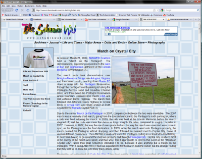
Still, this brings a few things together. For one, it explains why there have been few Journal entries this month, as I took production of these sets into high gear. It also explains how MPDC Captain Jeff Herold knows me, plus lends context to a Journal entry I wrote from home between the two G20 events. Then I also kind of went silent about Funk the War 7 and ANSWER’s alleged march on the Pentagon, which I referred to as the March on Crystal City. I did that partly because we spent more energy in Crystal City than at the Pentagon, and partly because I just don’t like ANSWER all that much, and calling it what it was drew attention to ANSWER’s off-the-wall march plan.
Still, I believe I’ve outdone myself with this. 218 photos and seven pages in the Crystal City set still just amazes me. This is why record-breaking photo sets are few and far between, with a few years between record-breakers. After all, from mid-2003 to February 2007, An Urban Comparison was the largest set, a distinction it held for nearly four years. Then on Valentine’s Day 2007, J27 became the largest by a small margin. Now today, March on Crystal City blew that distinction clear out of the water, as I broke that record by 77 photos (J27 has 141, and Crystal City has 218).
Of course, just because this project is finished doesn’t mean my work is done. I still have lots more waiting to be posted in photo set form…
Categories: Schumin Web meta
And this is why we don’t normally write Journal entries in the early morning…
2 minute read
March 18, 2009, 11:09 PM
So I was reading over the previous Journal entry, and I remembered why I don’t normally write Journal entries in the early morning. Yeah, I was a bit scattered, as my writing was kind of all over the place, there. I don’t even remember writing about the conservatives being back on their meds, for one thing, but there it is, and then I kind of went off on a shoe tangent at the end.
Lesson to take from this: Writing Journal entries while still half-asleep is bad.
But nonetheless, I’m excited for tomorrow. Funk the War ought to be fun, as long as I’m smart about my cameras. It’s supposed to rain on and off, and after losing Big Mavica in a rainstorm, the policy is that as soon as it begins raining, Duckie becomes the active camera immediately, even if it means I am denied use of the Canon at a protest for the second time in a row. So we’ll see what happens on this final day of winter, as we, like, rock out in the streets and denounce the war.
Categories: Anti-war, Schumin Web meta


 Continue reading…