Stuarts Draft High School
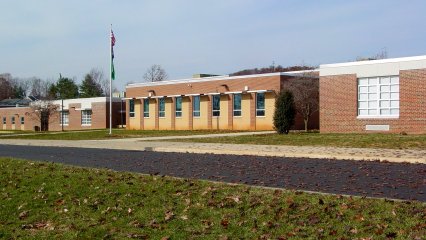 On February 19, 2011, while taking a day trip down to Stuarts Draft, Virginia with my friend Matthew (to show him where I grew up and such), we got the rare and unexpected treat of getting to visit my old high school, Stuarts Draft High School (SDHS). I graduated from SDHS in June 1999, as part of Stuarts Draft’s 29th graduating class. Since then, in the mid 2000s, SDHS had undergone a renovation, which brought the school building up to modern standards, added new spaces, reconfigured older spaces, and generally gave the building a new lease on life. This renovation, as with the renovations to the other four Augusta County high schools, was done around the students, as school was in session at the school while renovations were underway. In viewing the changes at my old high school, I realized that as much as things have changed, a lot of things remained the same. For one thing, despite the passage of twelve years and a renovation, a number of teachers were in exactly the same rooms as they were back when I attended in the late 1990s. Likewise, some spaces were barely changed from how they appeared before the renovation and thus were readily recognizable, while other areas were very different from how they once appeared.
In presenting this set, I am following my way through the school based on the way the room numbering was back during my time there in the 1990s and familiar to Stuarts Draft alumni prior to the renovation, starting at the location of what was historically Room 1, going around past the foreign language and English departments, into the science wing, down past math and social studies, through the auditorium and past the office, down to the home economics and music areas, over to the cafeteria and the gym, and then out to the Ag Building.
I also will admit – I was somewhat unprepared for this. I expected for this to be a quick drive-by and not a tour, and therefore left my camera at the house. Thus, I ended up taking these photos with my cell phone. The quality is not entirely where I would otherwise want it to be, but the point is still made.
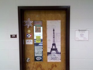
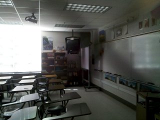
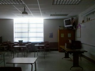
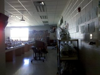
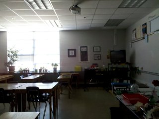
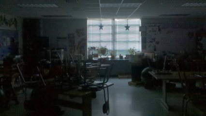
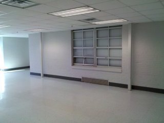
In my time at SDHS, this was Room 3, the original “IBM Lab”, as it was called. When the computer lab was originally installed in 1995, it had three rows of one-piece IBM EduQuest computers. These were upgraded in 1997 to the IBM PC 300GL. Now, as Room 29, the same space is again a typical SDHS classroom, now as Laura Stump’s French classroom. From what I could tell, most classrooms have their original doors, windows, and HVAC units under the window. However, the lighting is different, the chalkboards are now dry erase boards (guessing that this is just a retrofit over the old chalkboard), and a ceiling-mounted digital projector is now present. The ceiling-mounted television is left over from this room’s time as a computer lab, but from what I could tell, most classrooms now have a mounted television set.
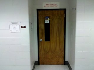
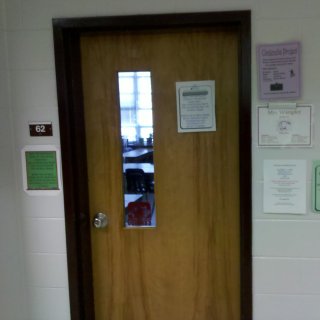
Room 30, formerly Room 4, is now Mr. Popeck’s classroom! My understanding is that he was in Room 4 the year before I arrived at SDHS, but he was in a windowed classroom all four years that I attended. Thus I was somewhat surprised to see him in an interior room. Prior to the renovation, there were two clusters of four interior classrooms, with one in the front and one in the back. Of the four walls in each of these classrooms, two were concrete, and the other two were movable partitions, which were used to combine two, three, or four of these rooms for various purposes. I was unable to view the interior of these classrooms, so I don’t know if the movable partitions still exist (but it would be reasonable to think that they do).
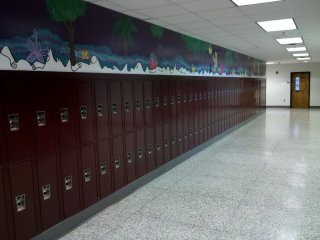
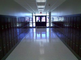
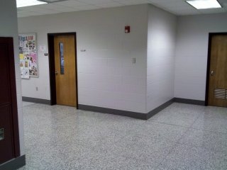
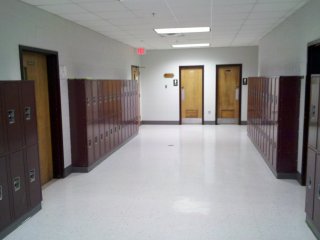
This is the new face of the locker area in the front of the school. I had my locker in this area (students generally kept the same locker for all four years at that time). The lockers had previously been arranged in rows perpendicular to the corridor (see file photo of the old lockers). This was no longer possible with the renovation, because a new, somewhat narrow room had been constructed in the space where these rows of lockers previously were, and thus the new lockers had to be mounted flat against the wall. The door to former Room 10 (Mrs. Dixon’s classroom in the late 1990s) is visible in the background.
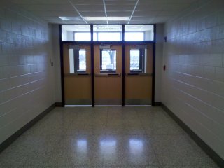
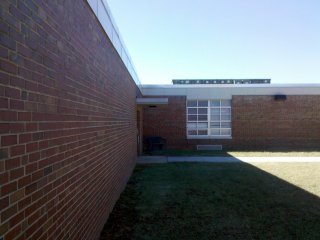
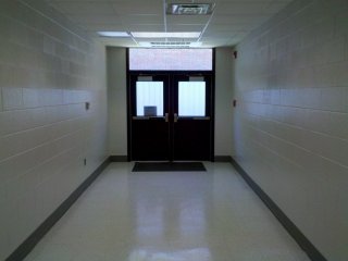
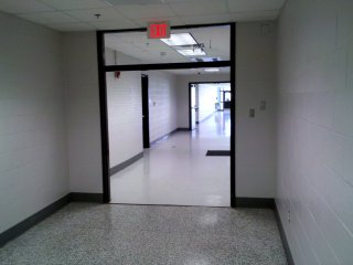
This short corridor to the parking lot between former Room 8 (left) and Room 7 (right) is mostly unchanged from my days at SDHS. The only differences are new doors, new lighting, and the new fire alarm on the right side (vs. the left before).
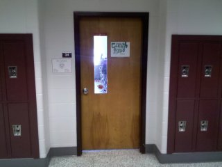
Some things never change. Coach Goforth is still in the same room as in the 1990s, though now it’s Room 34 rather than Room 8.
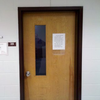
In another case of “the more things change, the more things remain the same”, Mrs. Hevener was also still in the same room as always, though what is now Room 38 was Room 12 in my day.
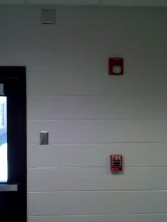
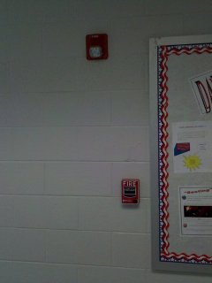
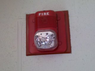
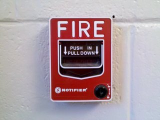
The original fire alarm at Stuarts Draft High School was a Simplex system, with Simplex-branded horns and Simplex-branded pull stations. This is what I remember from many fire drills in high school. This system was replaced during renovations with a newer system. Though I was unable to locate the new panel (the office was closed at the time), I saw that the new system used System Sensor horn/strobes and Fire-Lite BG-12 pull stations. What surprised me was the way the new system utilized the locations of old hardware from the old system. It seemed somewhat random. In most cases, such as seen at left in the rear (north) science wing hallway (former rooms 18-20), the locations of the old horns and pull stations were just plated over, and new openings were cut for the new system. However, in other cases, the existing openings were reused, such as seen here in the front (south) science wing hallway (former rooms 14A-17). And yes, the horn and pull station were always skewed like that in that location.
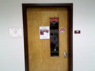
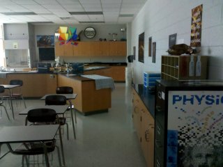
While the science wing probably saw the most radical changes in the entire school, some things remained the same. This is Mr. Almarode’s classroom, formerly Room 14A, and now Room 41. He was in this room when I was a student at SDHS, and he’s still in it now. I don’t quite know how this room originally came to be numbered 14A prior to the renovation, however. The room was unique in its size and layout compared to most SDHS classrooms (which were for the most part very standardized), but it appeared to have been built with the rest of the building. Therefore, it should have had a number like everything else (it should have been Room 15), but apparently it never received a number when the rooms were first numbered in 1970.
This is the location of what was once Room 17, historically Mr. Patterson’s room. The door to Mr. Patterson’s room was located where that line on the floor is at the bottom of the photo that separates the terrazzo floor from the tile floor. Mr. Patterson’s room, along with Room 18 on the other side, was completely demolished in the renovation in order to make way for a greatly expanded science wing.
All of the spaces shown here are completely new, constructed during the renovation. The old science wing had two hallways in it that dead-ended at Rooms 17 and 18, respectively. These hallways now continue into the addition on the science wing, and the two hallways now connect via a new third hallway. The photo at top left shows the end of the front (south) science hallway, that used to dead-end at Mr. Patterson’s room. The photo at top right shows the new hallway that connects the two original hallways. This view faces the rear of the school. Below left is Mr. Childers’ new classroom, and below right is the classroom of a teacher who wasn’t there when I attended. The newly built science classrooms are far larger than the old science classrooms, and have windows. Prior to the renovation, no science classrooms at SDHS had windows, even in Rooms 17 and 18, which had exterior walls.
View out a window in the new science wing facing the original building. The rear (north) science hallway is on the other side of the brick wall at left. My understanding is that the science wing was built with two hallways against exterior walls vs. one interior hallway was in order to share science storerooms. Unfortunately, this layout meant that the science classrooms were unable to have windows in them, though there was no reason for Rooms 17 and 18 to be windowless.
Room 63, formerly Room 27, was then and still is Mrs. Wampler’s math classroom. Her room looks the same as it always did, right down to the old typing tables that she used as her desks.
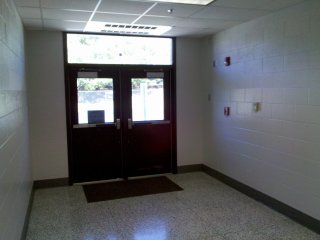
Short corridor to the rear entrance between Rooms 27 (right) and 28 (left). This small hallway was normally not used by students except during fire drills, but did see heavy use by staff due to the location of a small staff parking lot just beyond these doors.
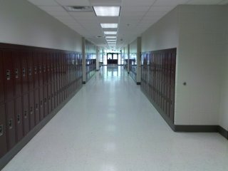
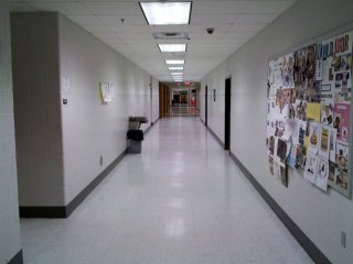
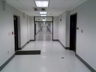
Social studies hallway. The photo at left shows the intersection of the rear hallway with the main social studies hallway, and the photo at right is the main social studies hallway looking all the way up to the front of the building where the foreign language classrooms are located. Compare this to a similar view in 2001, before renovations. The classroom door seen in the left photo is Room 65, former Room 30, which was Coach Parks’ classroom.
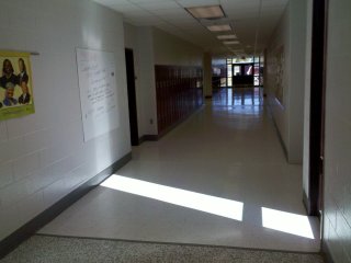
Another short corridor between classrooms, this one between Room 35 (the old Mac Lab, at left), and Room 33 (at right). The library is behind the camera in this point of view.
Fire alarms in the corridor above. In this instance, the new alarm equipment was placed over the old alarm equipment’s openings. However, in this case, the new System Sensor horn/strobe was placed over the trim plate from the old Simplex 4040 horn. On the new pull station, look at the paint around the station. The old Simplex pull stations were much larger than the new Fire-Lite pull stations, and thus the paint changes around the pull station, as the area covered by the old pull station does not have several layers of paint on it from a few repaintings done prior to the renovation.
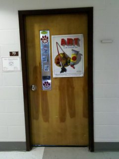
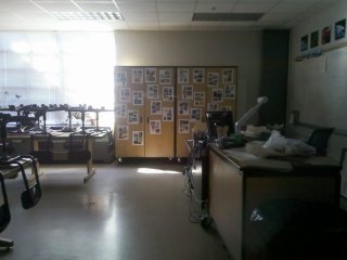
Room 70, former Room 35, was the old Mac Lab in the 1990s, filled with Macintosh LC (“pizza box”) computers. It is now an art classroom. My understanding is that before this room was made into the Mac Lab, it was an art classroom, and now it appears to have gone full circle, as it is an art classroom once again.
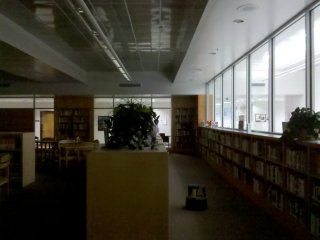
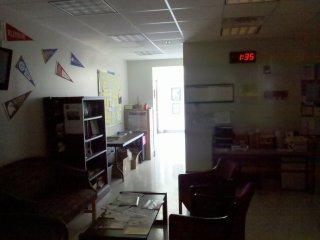
The library is at last completely walled in with the renovation. Previously, the library had few solid partitions and was defined mostly by floor-to-ceiling columns, with most “walls” made by bookshelves built between the columns (see file photo).
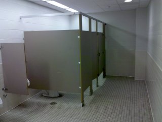
Men’s restroom across from where Guidance used to be. I want the male alumni to notice: high partitions and doors on the stalls! During my time as a student, there were no doors on the stalls in the men’s restroom, and based on the old stall partition design, they were never intended to have doors on them. Now they have corrected that problem with the renovation, giving male students the privacy in the restroom that they were always entitled to but never got.
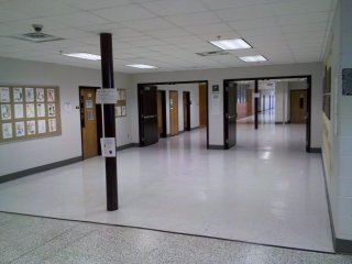
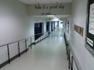
This area was once the biggest bottleneck in the entire school during class changes. The art room, formerly Room 36, is visible at left. This hallway was doubled in width during the renovation, taking space from some of what was Room 1 and Guidance to enlarge the hallway. The wall for this space used to run between the two floor-to-ceiling poles (one up close, and a second in the distance). Additionally, the two sets of fire doors at the center of the photo were added during the renovation. Prior to the renovation, there were no fire doors like this anywhere in the building.
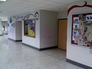
Above and around the entrances to the auditorium, it now reads, “Open your mind… So that you can… Prepare for your future!” In the 1990s, the message in this area was “EQUITY AND QUALITY FOR ALL STUDENTS” (in all caps).
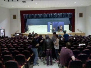
The auditorium itself looks the same as it always has for the most part. The lighting is improved, the seats were replaced, there’s new paint on the walls, and the stage itself has been updated, but it still looks very much like the auditorium where I did The East Coast Price is Right back in 1999.
Guidance is now located partly in the east end of the old main office, and partly in an addition constructed in front of the old main office. The front area of Guidance, seen here, is in what used to be Mr. Schindler’s office (i.e. the principal’s office).
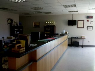
The main office is now partly in the west end of the space that contained the old main office, and partly in the addition built in front of the old main office.
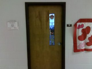
Room 19, formerly Room 38, is still the Home Economics (or whatever politically correct term it has become now) classroom. And as was the case when I was there, Mrs. Rhodes is still in her same room.
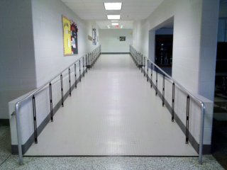
The entrance to the cafeteria has been reconfigured to make it more accessible. Originally, this area contained the entrance to the teachers’ lounge, a set of restrooms, and a small flight of steps down to the cafeteria (see photo from the 1996 yearbook), which was at a lower level than the rest of the school. Now, the entrance to the teachers’ lounge has been relocated to around the corner, the restrooms were completely reconfigured to face the home economics/music hallway, and the stairs have been replaced with a long ramp. This also eliminated the need for the wheelchair lift that was accessed through the teachers’ lounge.
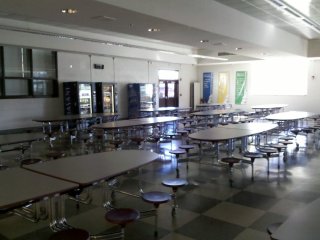
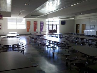
The cafeteria is mostly the same as it always was. The only changes are a new ceiling, removal of the old wheelchair lift, replacement of the stairs with a ramp, and a new exterior door that replaced one of the windows (in the top right photo). Unlike the floor tile in most of the school, the original floor tile was retained in the cafeteria. The large cougar image in the bottom photo covers what was once an electronic message sign that I used to program.
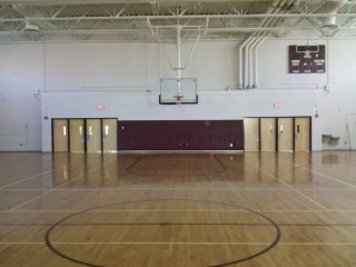
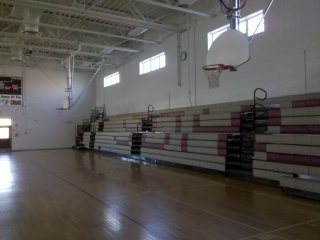
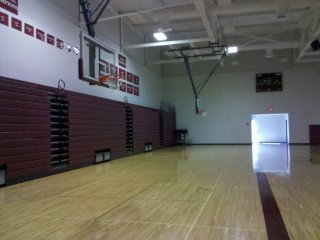
The original gym, now one of two gymnasiums at SDHS, looks mostly the same as it always did. Aside from new paint and a refinished floor, the only major change to the gym was the replacement of the bleachers with new ones that had “SDHS” written on them in large letters. However, what struck me most when going in here was how bare the space now looked. When I attended school here in the late 1990s, the walls were covered with banners and signs touting various athletic championships, and there was a large cougar mural on the rear wall. The mural has been painted out, and the banners and such were relocated to the new gym. Compare to the gym’s appearance in this early 2000s file photo.
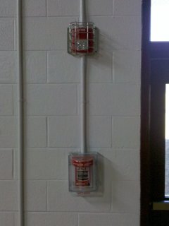
The new fire alarms in the gym received typical treatment for fire alarm equipment installed in gymnasiums, where there is a higher likelihood of the equipment’s being struck by objects. The new horn/strobes are in cages, and the new pull stations have Stopper covers on them. The Stopper covers are particularly important, as I remember an accidental alarm that happened during my senior year, caused by a basketball’s striking a pull station in the gym.
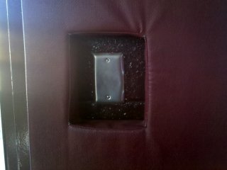
One thing that surprised me about the gym was that the padding on the walls behind the basketball goals was original. The proof was this hole in the padding, which went around one of the original Simplex pull stations. The pull station is gone now, but the hole remains, with the opening for the pull station plated over.
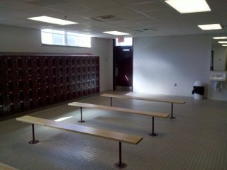
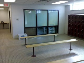
This is the old men’s locker room in the gym. It looks very similar to how it did before, save for new finishes on everything as well as new lockers. I would dare say that this room probably looks better than it ever did, even when new.
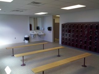
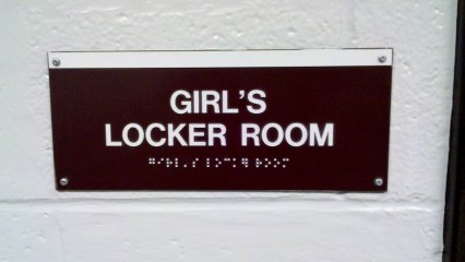
Surprise! The renovation also switched the gender designations for the locker rooms. Turns out that the old men’s locker room is now the women’s locker room (and the same presumably goes for the old women’s locker room). Note the punctuation error on the sign in the cafeteria, however. It should read “Girls’ Locker Room”, with the apostrophe after the “s”. As was the case before, however, the locker rooms are unmarked from within the gym itself, thus my not realizing that I was in the women’s locker room until afterwards.
At the end of the cafeteria hallway, the doors have been removed, and what was once an outdoor covered walkway to the Ag Building is now enclosed as part of the building. Therefore, the Ag Building is no longer a separate structure from the rest of the school, having been incorporated into the main building. Surprisingly, the window on an Ag Building classroom, now an interior room due to the construction of the new hallway, was retained. I would be interested in finding out why the shop areas were constructed as a separate building in the first place, because it seems to make far more sense to have them as part of the main building.
The former Ag Building itself looks the same as it always did, though due to new lighting, it now appears much brighter than it did when I was a student at SDHS in the 1990s.
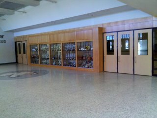
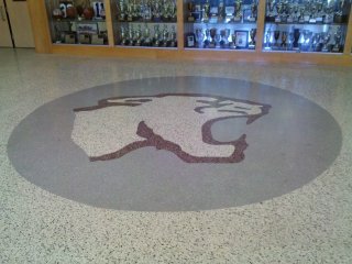
Besides enclosing the walkway to the Ag Building, the new hallway also provides access to the new gym. The hallway outside the new gym is the only place in the renovated school where new terrazzo flooring was installed, complete with terrazzo cougar graphics. Any other hallway areas that did not have terrazzo flooring from the original construction were completed with white tile. Someone please explain to me why the people who planned this renovation felt it necessary to spend extra money on new terrazzo flooring for the athletic areas vs. the less expensive tile that other hallway areas received.
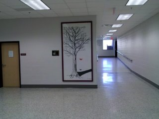
Outside of the entrance to the new gym is the only remaining artwork from prior to the renovation: a painting of a tree by David Branch, a 1996 graduate. This painting was previously located in the auditorium (it appears in that location in the ticket plug image from The East Coast Price is Right).
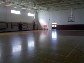
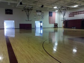
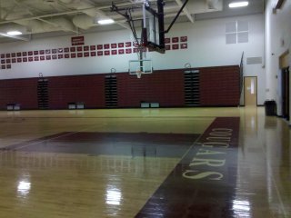
The new “competition size” gym, which appeared to be about the same size as the original gym, was constructed over the old tennis courts. Here is where all of the various athletic swag was now located. I, however, fail to see how a completely new gym was necessary, especially considering that physical education courses are not required beyond the tenth grade level in Virginia.
So there you have it, I suppose. This is Stuarts Draft High School as it now appears following a renovation. As the renovation was done around the students, more fundamental changes to the layout of the building were not feasible. Thus the biggest changes were in areas where new construction was involved. I believe that the treatment that various areas of the building received was somewhat unbalanced, as the athletic areas appeared to have had more money put into their enhancements than the academic areas. For instance, why did the area around the new gym get terrazzo flooring, while the new science wing, also new construction, got tile flooring? Of course, I also question the necessity of constructing a second gymnasium in the first place.
I was also surprised about some of the things that were retained. I was quite surprised to find that the original large windows were not replaced. By comparison, Fort Defiance, Buffalo Gap, and Riverheads High Schools got new, smaller windows, with stuccoed panels filling the extra space around the new windows. See this photo from Wikipedia of Buffalo Gap High School. Likewise, I was surprised that the original air handling units under the windows were retained. With all of the other alterations to the building, I’m surprised that they didn’t put new HVAC equipment in the ceiling.
I was also surprised to see that the rooms were numbered in roughly the opposite order as they were before. Numbering now starts in the Ag Building and ends at the old Mac Lab, while previously, numbering started next to the old Mac Lab and went up as one approached the Ag Building.
Lastly, this renovation also goes to show how much better a place can look with improved lighting. One of the things that made SDHS appear so dumpy prior to the renovation was the lighting. Prior to the renovation, the lighting was not very bright, and made things appear dingier than they might otherwise actually be.
Hopefully, though, this new version of Stuarts Draft High School will serve the community of Stuarts Draft for another 35 years or so, just as the original version did.
