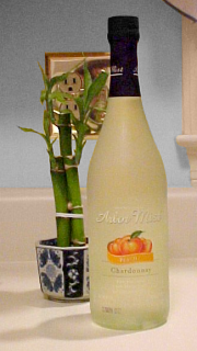
“Now that deserves an Arbor Mist!”
 You’ve probably seen the commercial before… the men come up to the women who are enjoying Arbor Mist. The women ask what they’ve done to get some Arbor Mist. So the men start building a sand sculpture… it’s kind of blah at first (“An Arbor Mist for that?”), but eventually, Michelangelo’s David emerges from the sand – that deserves an Arbor Mist. Why did I bring this up, you may ask? Well, unless something’s gone terribly wrong, you are looking at the first quote on the new site design for the 2002-2003 season. Those who have been with me over the years know that I tend to change up the site’s design every year, generally in the summer. So… ta-daa! I took a site that was kind of a pale gold color, with bits of gray, green, and maroon thrown in to keep the site interesting, with a side menu, advertisements on the bottom, and a lot of stuff all around. All in all, the screen was full, and the appearance varied depending on what resolution your screen was set at. Now, the site’s gone to the Web’s classic blue, white, and purple, with some beach-blue thrown in to keep it real. The menus now are drop-down, with the goodies hidden until they’re needed, helping contribute to keeping the site looking neat and trim. I’ve also made better use of my space. Now, everyone at 800×600 and up sees me the same way, since the tables are a fixed width, and don’t go out to the edges. Additionally, the circles of the old site have yielded to these new header bars, which are wider, and allow for much more expression on a canvas that’s only slightly larger than the circles that they replaced. And of course, like the circles before them, these header bars will certainly change. Recall that the Photo Essays circle was originally a beach theme, and then was changed to a flag after I did The Schumin Web Salutes America, which was done to celebrate the Fourth of July. I originally planned to keep rotating images into the circle as new photo essays came online, but then after the September 11 terrorist attacks, it was determined to keep the flag. But now, change is in the air again, as the flag is gone and an array of images replaces it. All in all, after more than a week’s worth of work, which included reprogramming, reconfiguring, and rewriting, as well as the creation of new content, we’re ready, and hope you like it.
Date posted: July 27, 2002
Notes: The wall at my parents' kitchen was actually yellow at that time. This photo was digitally altered to create the gray wall in order to better bring out the color of the wine.


